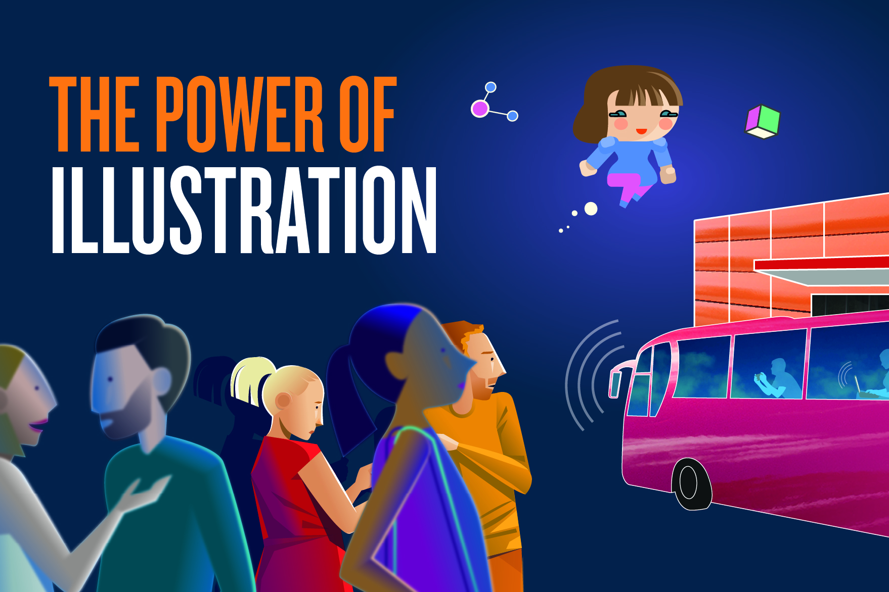
At Design102 we’re experts in helping our clients choose the right visuals to communicate their message. One of the main things we have to think about when selecting images is whether illustration or photography – or even both – would work best.
Every project is different, and every image serves a different purpose. Photography is perfect if you need to show something specific that people need to see accurately, if you’re reporting on an event, or if you want to show real people and their stories.
But illustrations can be much more effective when you want to spark your audience’s imagination. They are great for explaining concepts or getting the audience to see themselves in a certain situation. Here’s why we recommend illustrations, plus our tips on how to make them powerful and engaging.
Illustration has no constraints
With a photoshoot you are limited to the set, location and models available. With an illustration, your characters can look however you want them to look, wear whatever you want them to wear and be anywhere you want them to be.
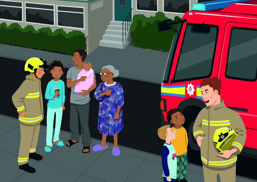
Illustration can be a great way of explaining concepts or ideas. You can use visual metaphors, or show things that aren’t easy to photograph.
You can go as far as your imagination takes you.
People relate to illustrations easily
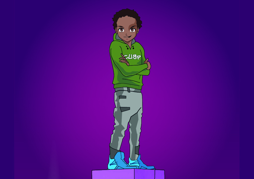
Illustrations can help bridge cultural gaps. People’s ability to relate to a person in a photograph can depend on how much they see themselves to look like the person. Unconscious biases may also come into play.
An illustrated character is more like a symbol for a person – it’s not expected to look exactly like anyone in particular. This makes it easier for more people to relate.
Illustrations can help with accessibility too, as they can make information easier to digest. They can break up long sections of text, making it more readable. When used in infographics and rich pictures, illustrations can really bring things to life, and are a powerful way of breaking down complex ideas.
You can protect identities
Sometimes Design102 works on sensitive projects that have confidential elements. An example is the recruitment campaign we created for GCHQ. They wanted to reach more women and young people, and encourage them to apply to work at the organisation. However, GCHQ employees’ identities are top secret! Our challenge was to find a way to share people’s experiences of working at GCHQ, without actually showing the employees.
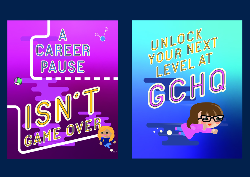
Character illustrations worked extremely well here. We were able to show real people and tell their stories in an engaging way. It humanised the organisation, showing character and personality, while still protecting everyone’s identities.
With recruitment campaigns it’s very important to get the balance of representation right. Diverse character illustration can help people relate to the idea of working somewhere. A photo of a specific person might cause people who look different to think “they must not be talking to people like me.”
Another example is content about domestic abuse. Here identities need to be kept discreet, but people also need to feel seen and included. A relatable illustration can go a long way in a situation like this.
Why not use illustration AND photography?
Illustration and photography can be used together very effectively. This is a great way of adding more meaning to a photo, bringing in colour or movement, or making it more personal. There are many techniques for combining photography and illustration. For example, collage or drawing over photos.
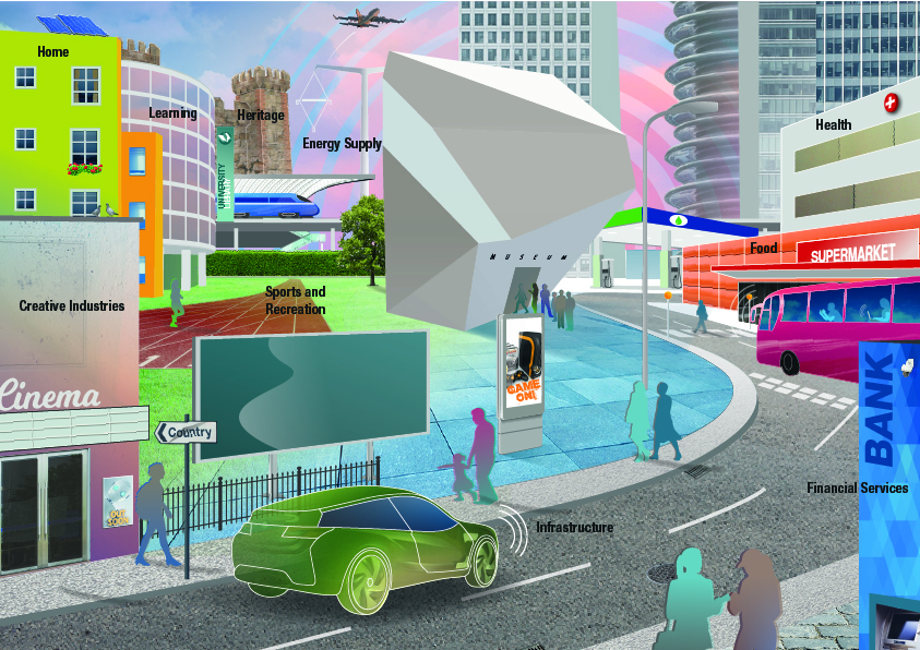
How to create engaging illustrations
There are plenty of illustrations available on sites such as iStock, and many of them are customisable. However, sometimes the best option is to create something bespoke – tailor-made for your audience. This way you can guarantee that the same image won’t be seen anywhere else, and you can ensure that it gets your exact message across.
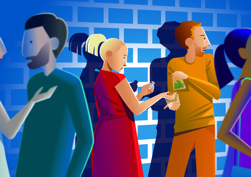
The mood and tone of an illustration can vary hugely, so it’s important to think about your audience, and what feeling you’d like to get across with your image. For example, a caricature style can be more playful, whereas an illustration with accurate shapes and proportions could be seen as more serious. Things like colour and texture also play a big role in the mood of an illustration.
Would you like your image to be corporate, or whimsical, or serious, or humorous? Would you like a modern and futuristic look, or something retro and nostalgic?
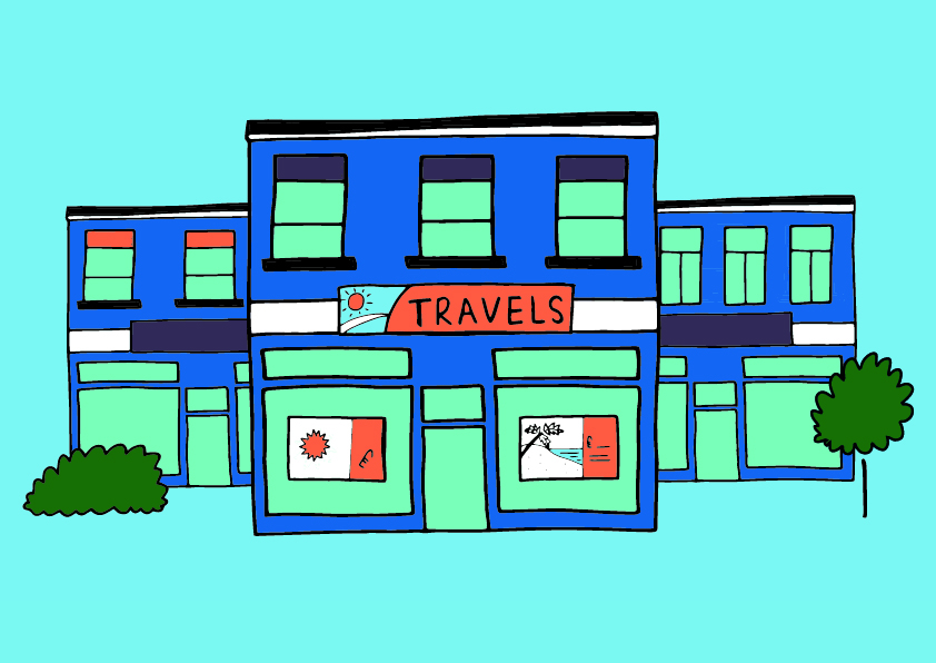
Another thing to consider is how much illustration you’d like to use. One bold image on its own is impactful and makes a statement. A series of illustrations can be used sequentially to tell a story.
Whether you want to grab your audience’s attention or tell a story, illustration is a creative way of making people think. As you can see from our examples, a style can be created to fit any purpose or tone, and imagery can be made as bespoke as you like.
So, will you give illustration a go?
If you’d like to know more about Design102 or you’ve got a project we can help with, just drop us a line at hello@design102.co.uk
For regular Design102 updates ...