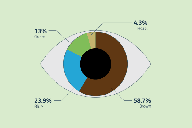
If your project involves large amounts of data, how you present that information is crucial for ensuring it’s clearly understood. Design102 explain why data visualisation is the design solution you need to make your data more vibrant, engaging and accessible.
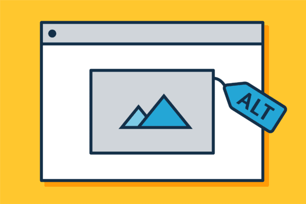
Design102 explains why and how you should be writing good alt text. Alt text helps users to access and consume content by describing in words elements that might otherwise rely solely on visuals.
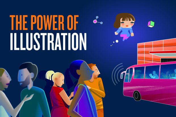
Illustrations can be really effective when you want to spark your audience’s imagination – which helps them understand and relate to your subject matter. Here we discuss this idea further and give our tips on creating powerful, imaginative and engaging illustrations.