At Design102, we believe that government communication should be clear, evidence-based and accurate. From annual reports to public campaigns, the way that information is presented plays a key role in ensuring that messages are understood.
Research and insight are vital for informing government communication, but gathering statistics is only half the process. With large amounts of data, it’s even more important to present the information clearly and prevent any meaning being lost. This is where data visualisation can be a game changer.
Data visualisation is the art of representing information in a visual way that makes it easy to understand. There are so many creative ways to display your data that go beyond dense tables and uninspiring bar graphs to bring the raw facts and figures to life. These include:
- alternative chart types to rank data, show how it’s distributed or compare proportions of a whole
- infographics to show subject overviews, themes, trends or patterns
- illustrations to demonstrate timelines, journeys or processes
So if your project is data-heavy, here’s why we recommend using data visualisation, along with examples of our work.
Data visualisation makes the complex clear
Data visualisation takes complex information and presents it in a well-structured and easy-to-follow format. Using lots of tables and figures can be overwhelming, and even meaningless if your audience doesn’t know how to interpret them.
Doing this work for them by transforming the key points into a clearly presented visual will ensure that as many people as possible understand the relationships and patterns in your data, without the risk of it being misinterpreted.
Visual information is quicker for us to process
We process visual information much more quickly than written information, as our eyes are immediately drawn to colour and graphics. Whether you want your audience to recognise a trend, understand a process or simply take on board the main facts, they will internalise the meaning more quickly with data visualisation, enabling them to make faster decisions and take effective action.
Visual information is more memorable
Tables and figures are often so dense that they fail to make information memorable. Bringing your data to life through eye-catching charts, timelines and illustrations will go much further to spark your audience’s curiosity and keep them engaged.
Finding a narrative can really help, so think about what the key message of your data is. Does it convey a theme, journey or process? Telling a story by transforming the statistics into vibrant visualisations is a great way of ensuring they are remembered – and will help influence your audience to change their behaviours.
Data visualisation prioritises your audience
Data visualisation keeps your audience at the heart of your project. It makes them part of the story, saves them time and draws their attention to otherwise unclear details. These are all powerful methods of making your communications more effective.
Through careful design choices, colour solutions and use of signifiers, data visualisation also ensures that your data is as accessible as possible for people with different needs – from colour blindness to dyslexia and dyscalculia.
Examples of data visualisation in action
COVID-19 social media charts for the Ministry of Justice
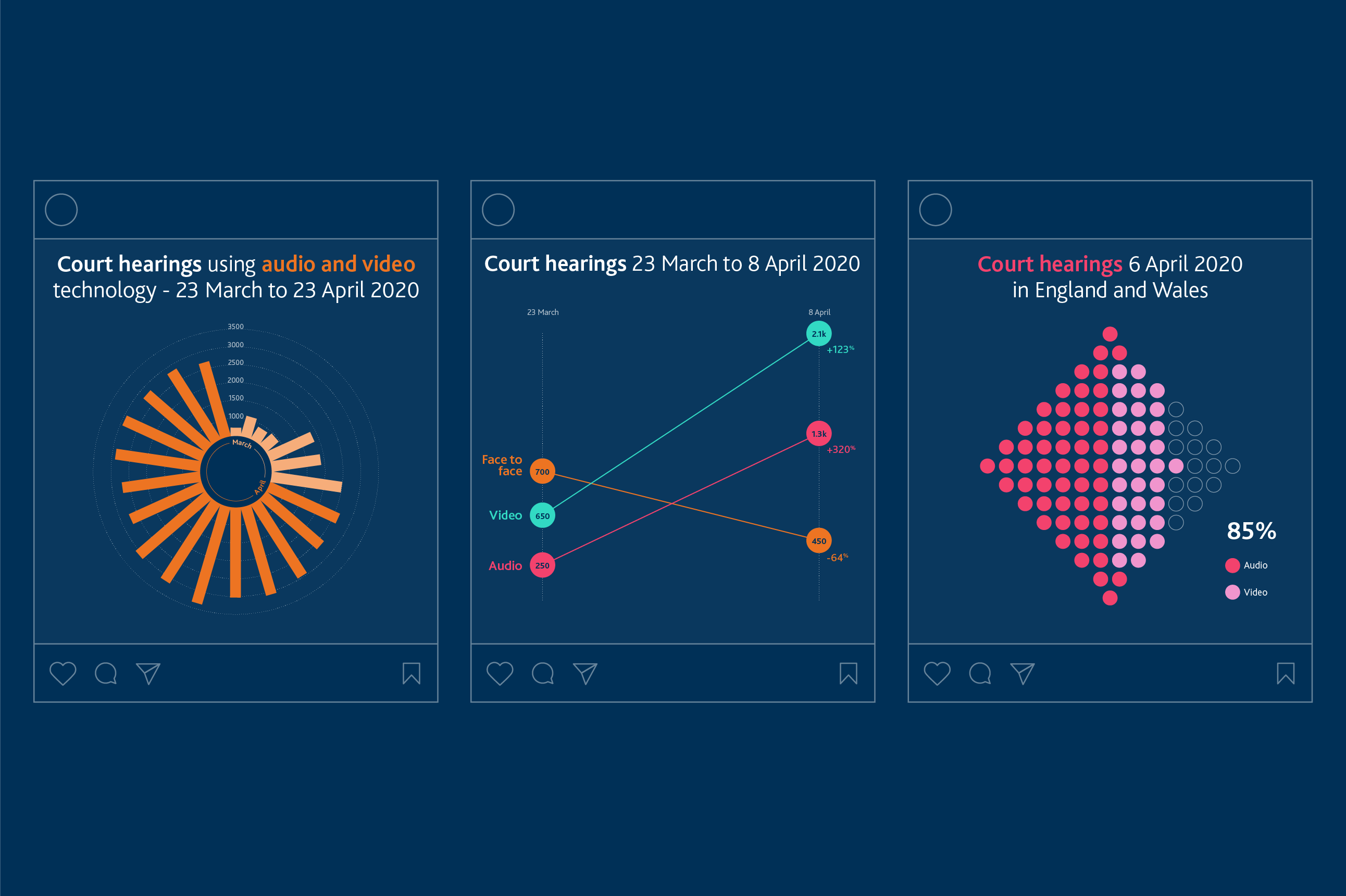
In this example, the Ministry of Justice asked us to create social media statics of data collected on the use of audio and video in court hearings during the COVID-19 pandemic. The data was originally provided in a basic table, with no explanation of its overall significance.
We analysed the information to apply ranking, part-to-whole, distribution and proportion data sets. We designed a series of dynamic charts and plots specifically for use on social media, enabling the audience to easily make comparisons and identify important trends.
Heat networks project for the Department for Business, Energy and Industrial Strategy
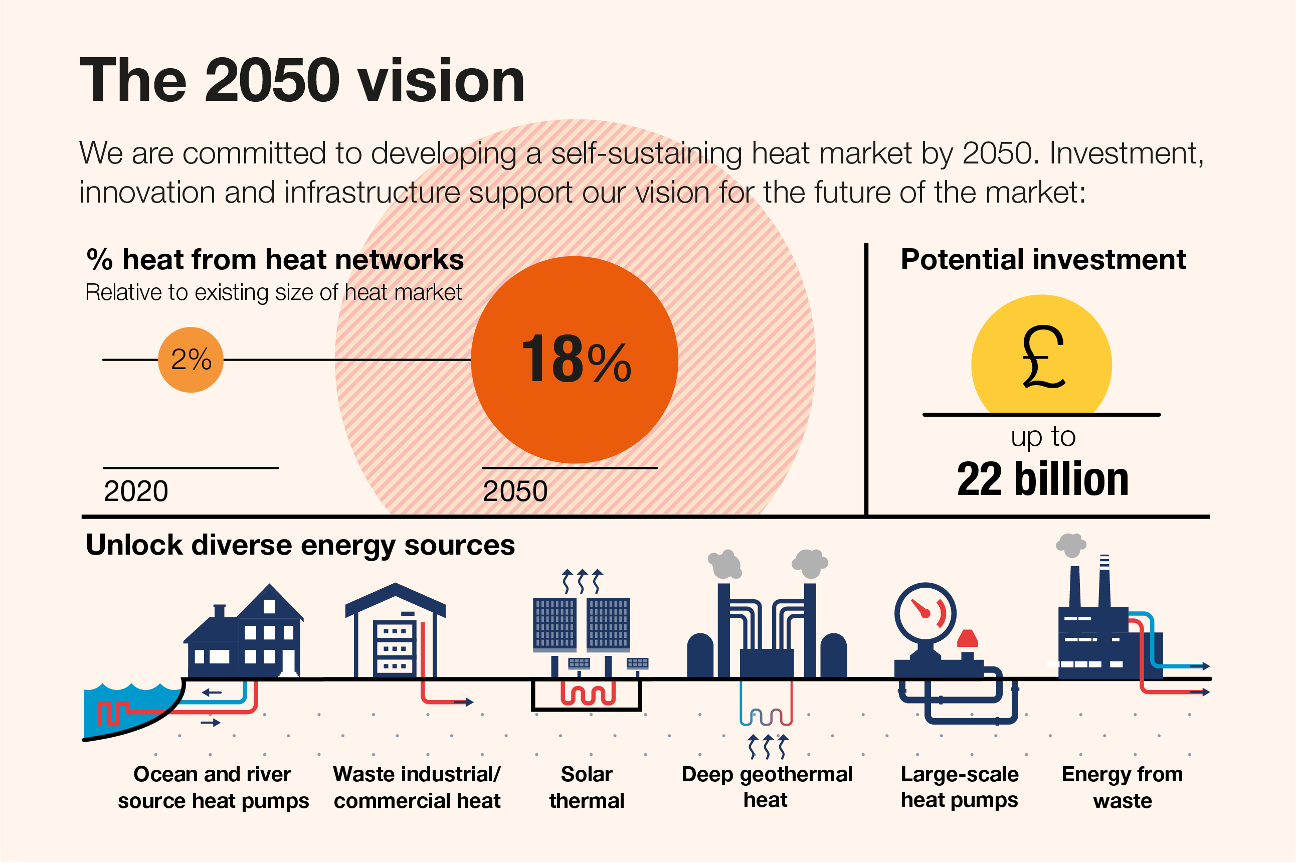
The Department for Business, Energy and Industrial Strategy wanted to convey its 2050 vision for the future of the UK heat network market in a memorable way, but the information was supplied as a list of raw statistics.
We converted the list into a themed infographic, simplifying the original information to snappy phrases, separating it out into different sections and using a mix of icons and graphics to convey the key facts.
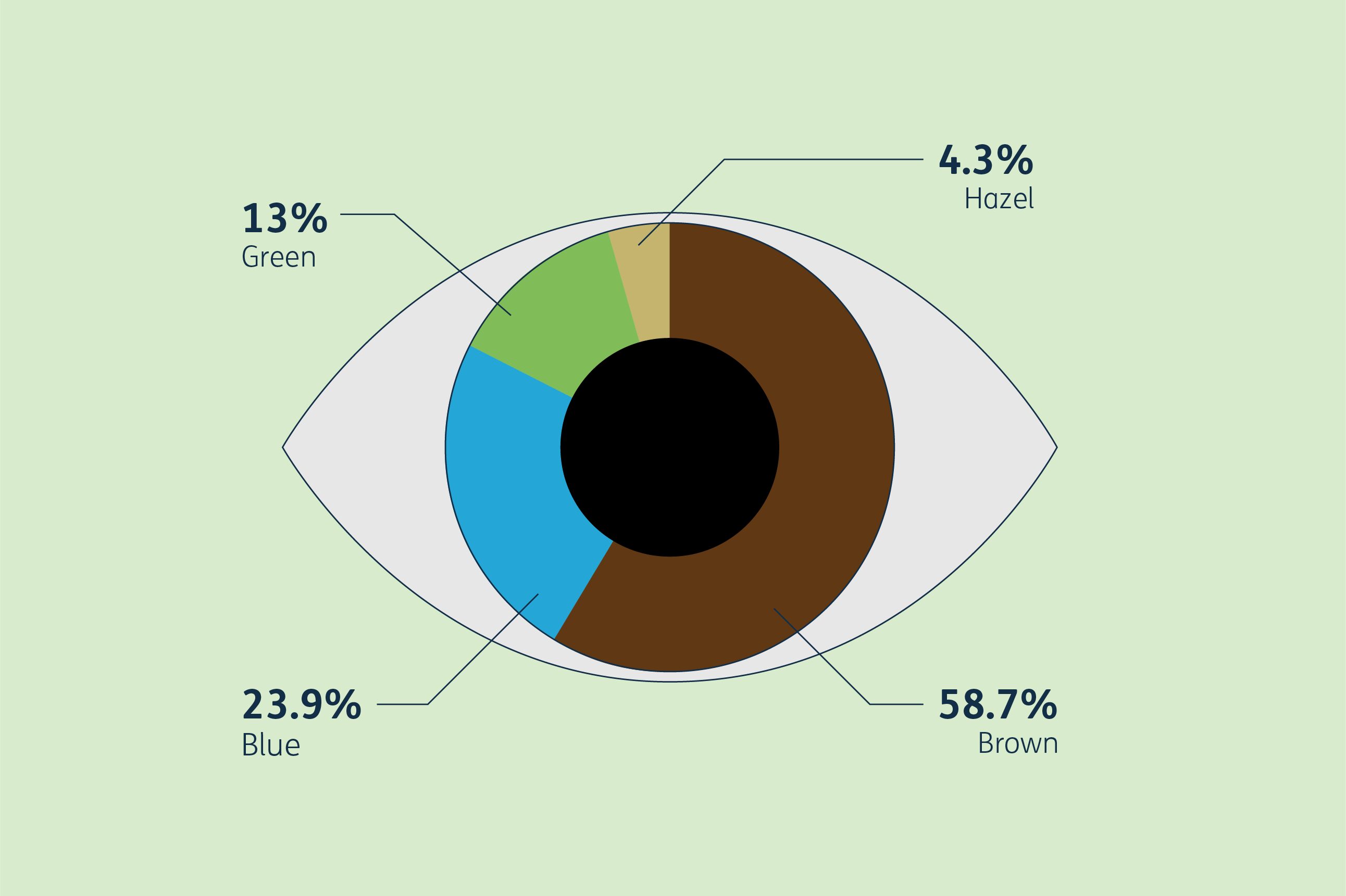
Inclusion Allies survey for Design102
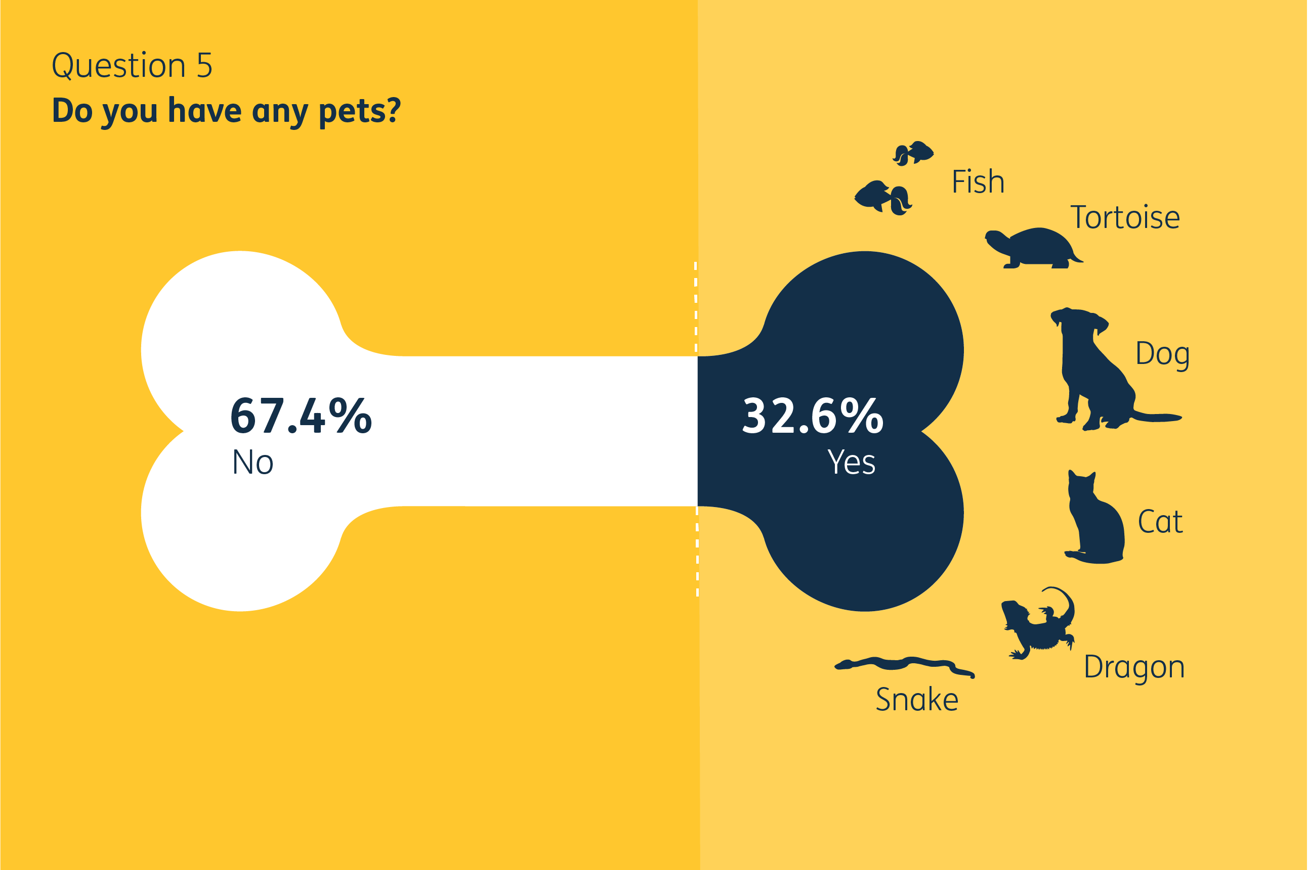
To provide insight into how diverse we are as a team, we asked staff at Design102 to complete an Inclusion Allies survey, covering everything from our views on inclusion to the little quirks that make us all individuals.
We came up with imaginative ways of visualising the data to present the survey results. We created a bespoke chart or illustration for each of the 26 questions, using a mix of more informative and more light-hearted designs tailored to the subject matter.
Our examples show how good design really can transform data and make your project more vibrant, engaging and effective.
If you would like help deciding which design solution is right for your data, or you’ve got a project we can help with, just drop us a line at hello@design102.co.uk
For regular Design102 updates ...