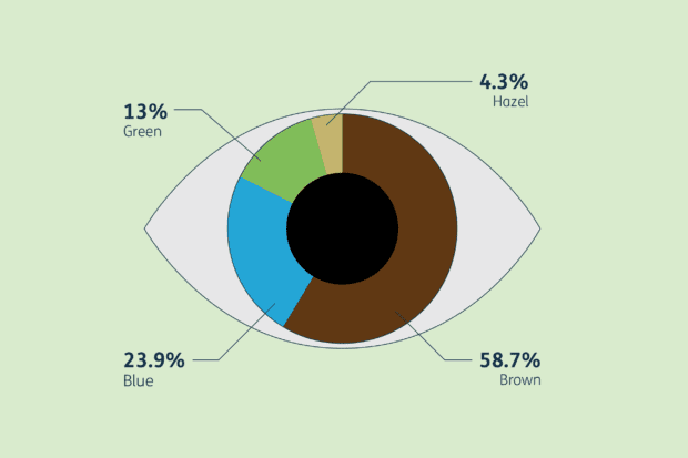
Data visualisation: how can good design transform your data?

If your project involves large amounts of data, how you present that information is crucial for ensuring it’s clearly understood. Design102 explain why data visualisation is the design solution you need to make your data more vibrant, engaging and accessible.