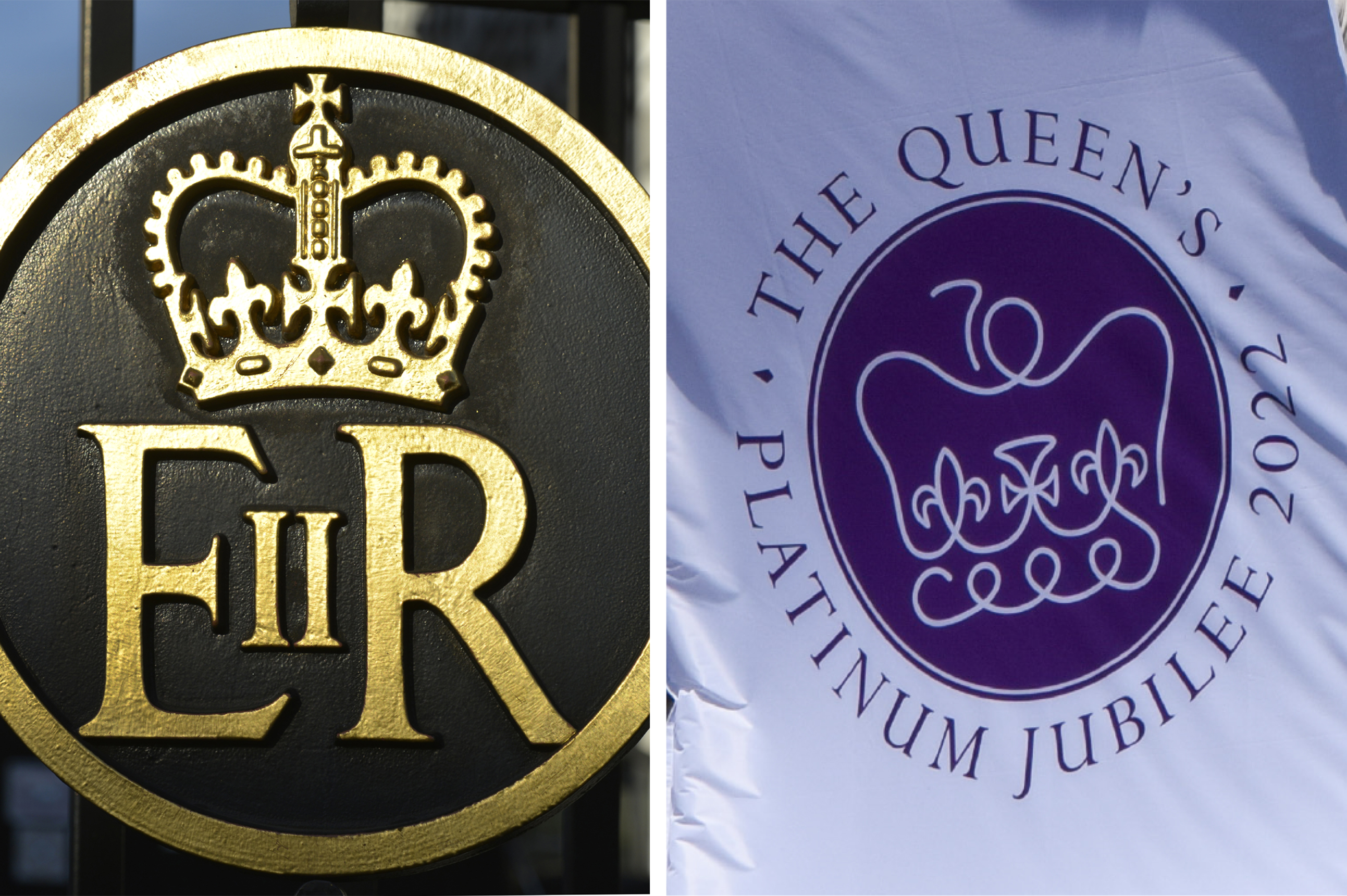
In June 2022, the UK celebrated the Platinum Jubilee, marking 70 years of Her Majesty The Queen’s reign. Since this occasion led to many people looking back over the years, here at Design102, we thought we would too. We consider some major designs of the last 70 years, and talk about how the past continues to influence the present in our own work.
1952 – Saul Bass
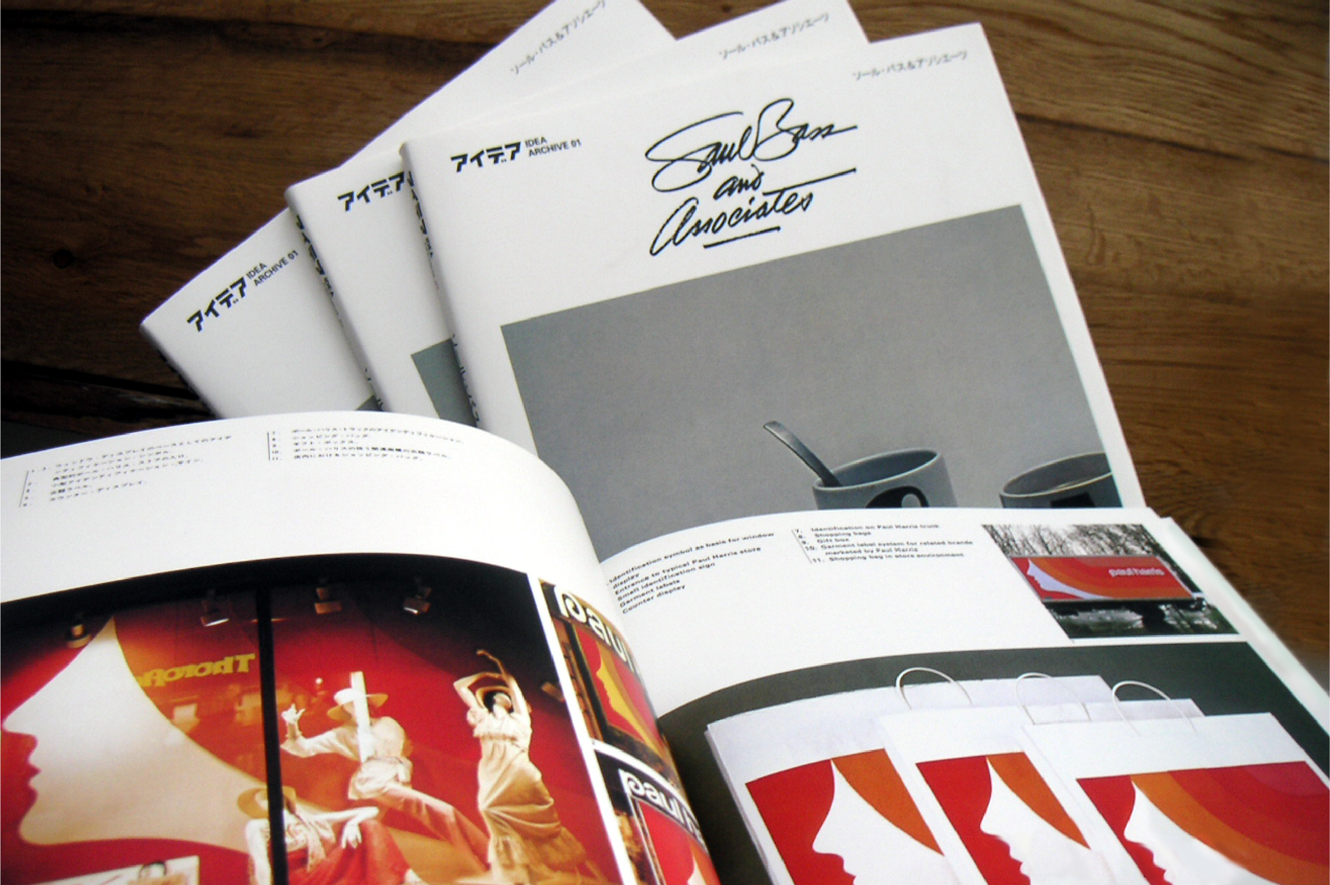
Her Majesty The Queen began her reign in 1952. In the same year, the legendary designer Saul Bass set up his private firm, Saul Bass and Associates.
Although he created some remarkable brand logos that are still around today (have a look at Kleenex and Continental Airlines, for example), Saul Bass made his name working in the movie business.
His signature style consisted of simple, hand drawn geometric shapes placed on block-colour backgrounds alongside expressive type. He applied this style to create some of the most iconic movie title sequences and posters cinema has ever seen. Both Psycho (1960) and North by Northwest (1959) are great examples.
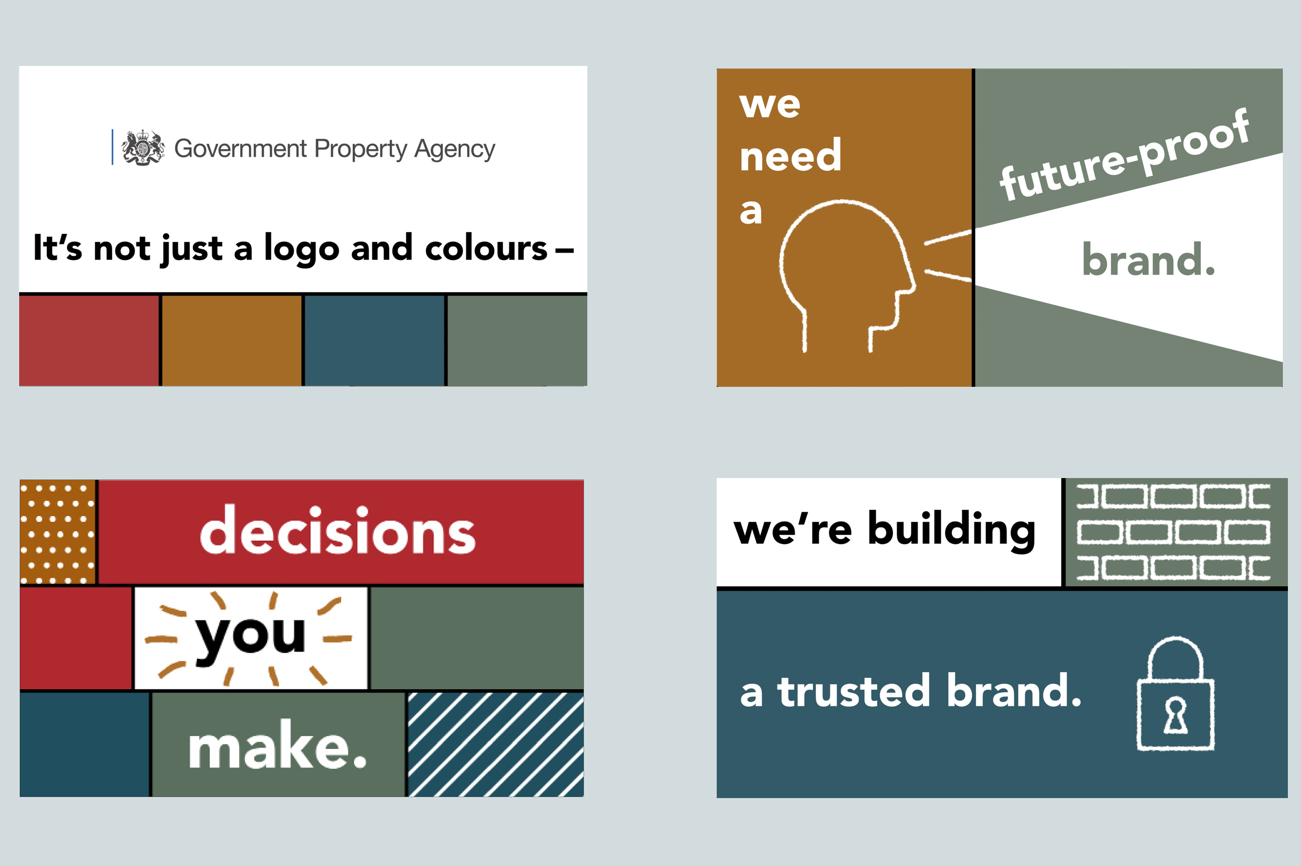
We were recently inspired by Bass’s moving image sequences when designing an animation for the Government Property Agency. We used a simple and modernist aesthetic for this project, but because there was no voiceover on the animation, the Saul Bass-inspired prominent titles helped get the message across effectively. The graphic icons we used were also simple constructions made with a hand drawn effect, similar to Bass’s work.
1982 – Channel 4 logo
Our next example comes from Martin Lambie-Nairn, the designer behind numerous ‘idents’ created for UK television. An ident is a moving logo used by TV channels to identify themselves between programmes.
Lambie-Nairn’s first ident was for Channel 4 back in 1982. This consisted of a numeral ‘4’ broken down into 3D coloured blocks. Over a few seconds the blocks break apart and swing round a central axis before reassembling themselves back into the shape of a ‘4’.
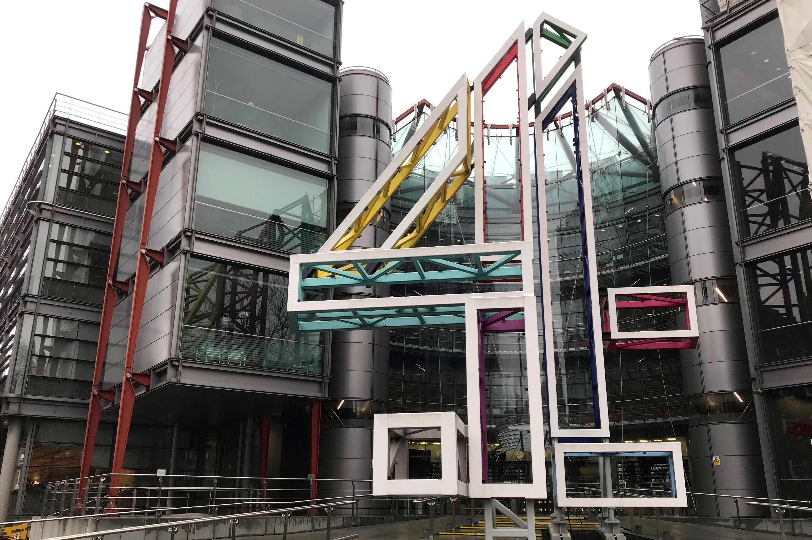
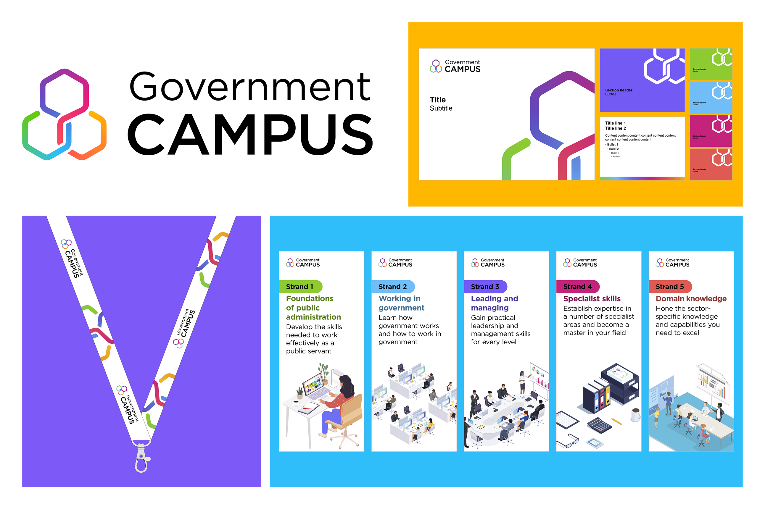
Although the moving image ident was genuinely revolutionary, the static logo itself is noteworthy. When we were asked to create a logo for the Government Campus, we used a similar approach.
Because the campus is a location that connects people and helps them to share knowledge, the logomark design used a single strand to form inter-connecting hexagons. This creates a sense of physical space and community. The colours reflect diversity and inclusion, as well as the multiple routes into learning that any individual might take.
2012 – London Olympics
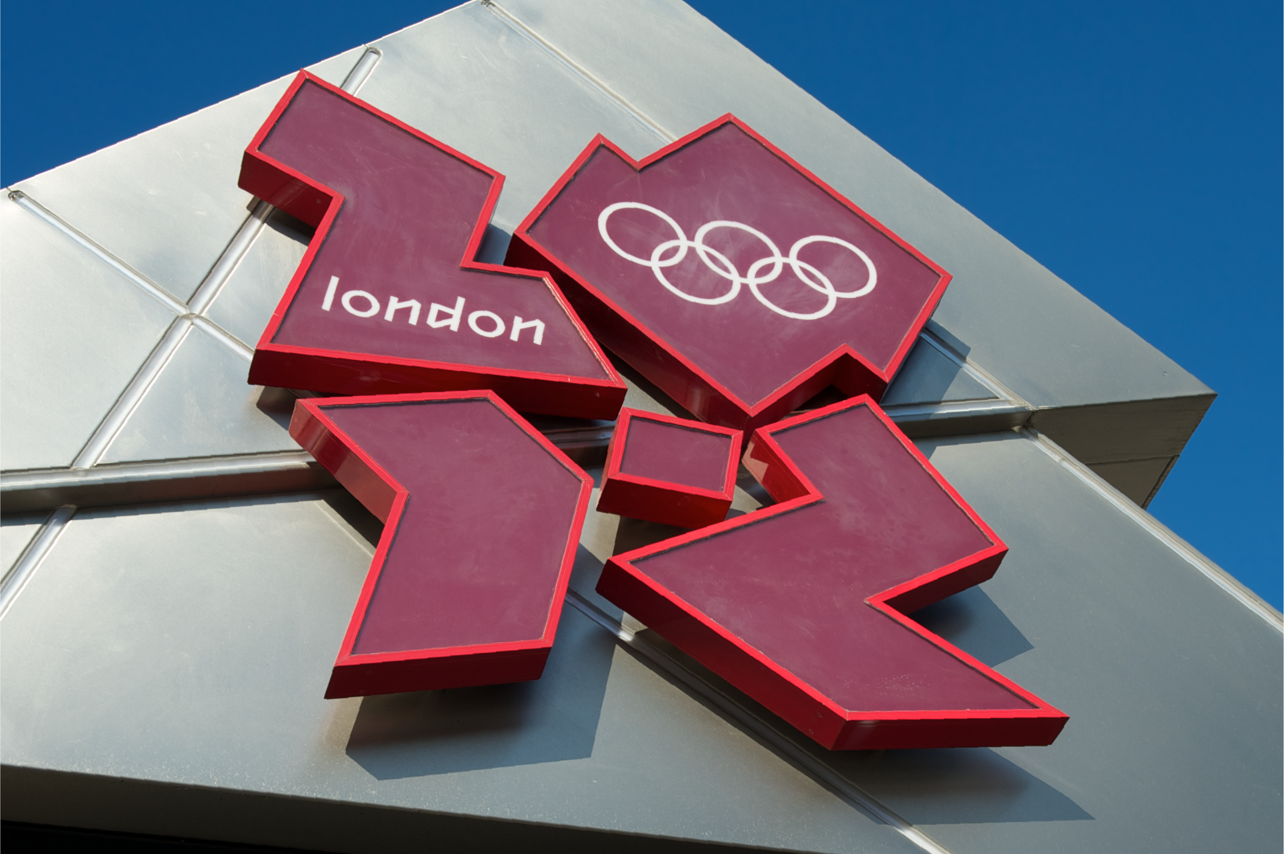
The London 2012 Summer Olympics was one of the most impressive events the UK has ever seen. People tend to remember the branding as much as they do the sporting spectacle, mainly for the hit-and-miss reception.
Many people felt the very expensive logo (£400,000!) didn’t represent the UK or the games. Others saw the ambitious design and accompanying branding as edgy and vibrant, and felt there were solid justifications for adopting an approach of using irregular shapes and CMYK colours. The games were more than just about sport, and London is a vibrant and dynamic city. Why should the logo be straightforward and ordinary?
We wanted to create something similarly bold and expressive for the Road to Results Day campaign we developed for the Department for Education. They wanted to help parents and children access guidance around the options open to children after they’ve finished studying. This was all about youth and opportunity, and the idea that there’s lots of possibility out there for young people. We used arrows and paths to bring across a sense of journey and direction. Much like the Olympics branding, angled graphics and bright colours provided a sense of pace and energy.
Has your child received their results?
You can get help and advice about all the choices available, from work based training, going to university, or into the workplace.https://t.co/TVNIsqP8Cv
Speak to advisers via webchat or call @NationalCareers free on 0800 100 900 pic.twitter.com/betCHbtI9e
— Department for Education (@educationgovuk) August 17, 2021
2022 – Platinum Jubilee logo
For this last example, we’re going to go in a slightly different direction and look at a great example of recent design, and how it reminds us of current government branding.
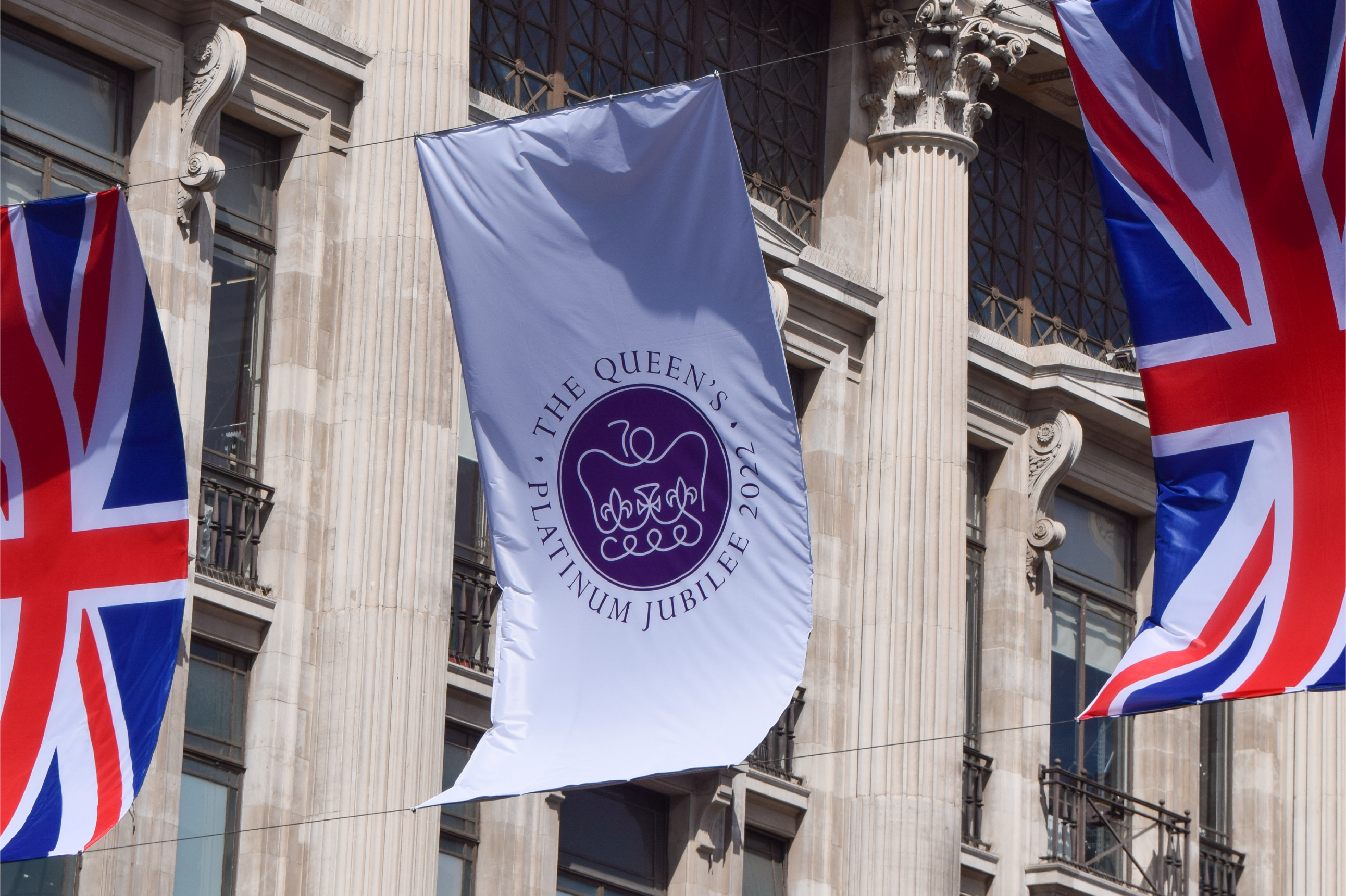
Since it’s the Platinum Jubilee year, we think it’s fitting to look at the emblem designed by Edward Roberts, a 19-year-old student from Nottinghamshire, whose design was selected through a competition.
The emblem is a single continuous platinum line that illustrates a simplified St Edward's Crown with a number 70 above it, the only other colour being the royal purple background. By sitting within a circle, the design also neatly references a royal seal.
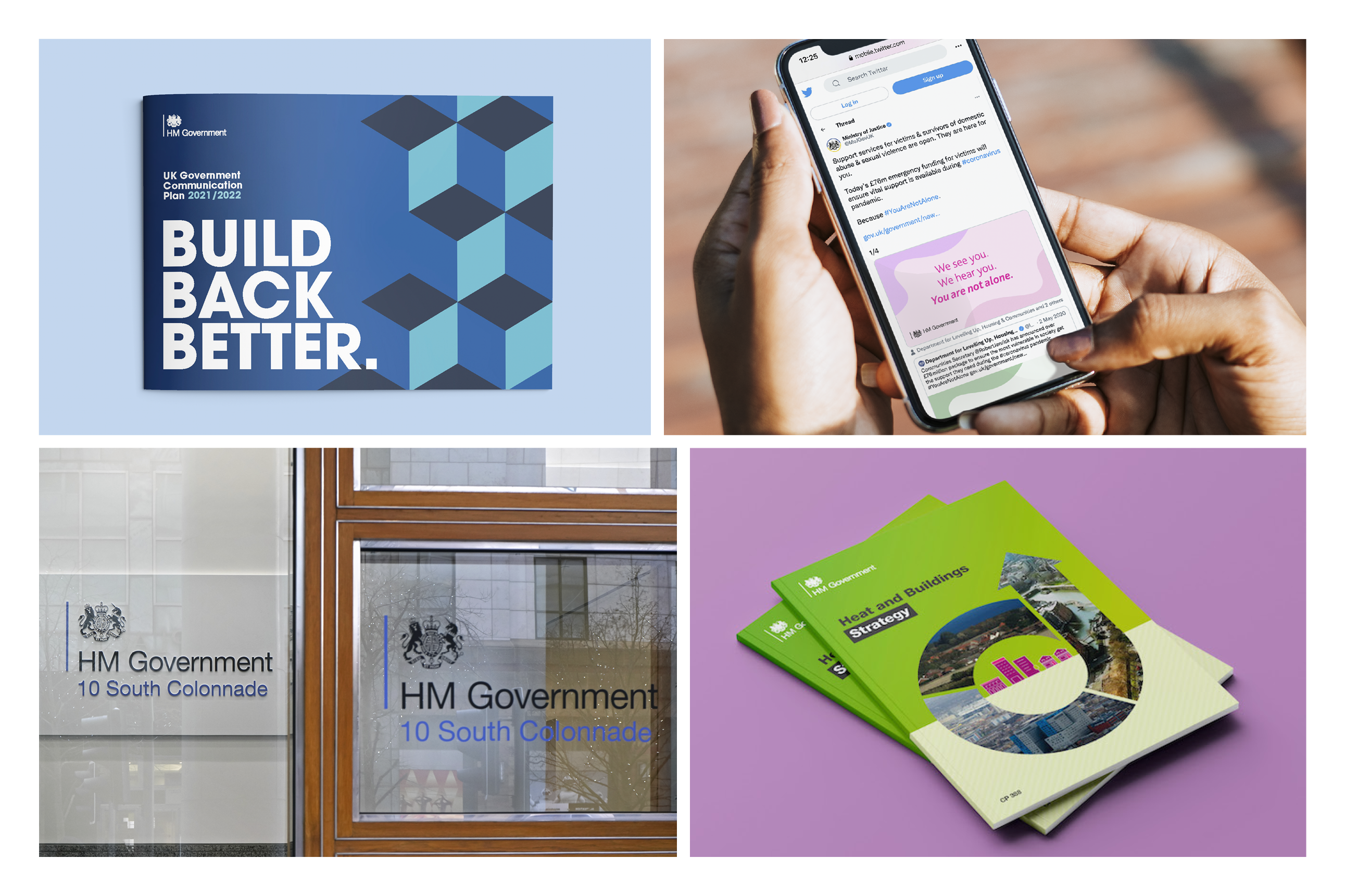
The strength of Edward’s design comes from its simplicity, and we can draw a comparison between this approach and the system of branding that includes a Royal Coat of Arms and is used across government communications.
Before 2011, each government department had a very distinct brand, meaning it was hard to tell which organisations belonged to government and which did not. Because it became necessary to create a way of making these organisations more recognisable as government entities, the ‘government identity system’ was developed.
The system is used to create unified brand logos for government departments and agencies by simply combining the Royal Coat of Arms with the name of the department and a single identifiable line of colour. This is a simple and effective way of creating a sense of family among all departments, and it lets people know that they’re dealing with the government.
You can see from these examples that we’re always looking to draw inspiration from the most powerful examples of design. We understand that it’s important to acknowledge our roots because this gives us a firm basis from which we can create new and ambitious designs.
If you’d like to know more about Design102 or you’ve got a project we can help with, just drop us a line at hello@design102.co.uk
For regular Design102 updates ...