
Your brand affects how your organisation looks, feels and comes across to others, so it’s important to get it right. This blog post explains the differences between rebranding and refreshing your brand to help you decide what’s best for your organisation.
What makes a brand?
Branding is made up of various components which can include:
- visual elements – like your logo, colours, typefaces, image style, typography and core graphics
- textual elements – like your name, strategy, narrative, vision and values, purpose, and tone of voice
- other sensory elements – like materials used in print and in interiors
- intangible elements – like your company history and reputation
Your brand can be communicated across every touch point your organisation uses, however small or large. This includes your website, adverts and campaigns, publications, stationery, email signatures, and office environment.
Why rebrand or refresh?
There are many reasons you may wish to consider a rebrand or brand refresh, including if you are changing your services or offerings, undergoing a structural change or merger, pursuing a new strategic direction, or underperforming in some way and in need of a re-route.
However, proceed with caution if the team or organisation is simply bored of current branding, new members of staff are looking to ‘make their mark’ by rebranding, or if current branding is under-performing because it has not been well-managed.
What’s the difference between a rebrand and a brand refresh?
A large change from your existing branding would be classed as a rebrand; for instance, changing the name and logo beyond recognition. Smaller changes, such as adjusting the colour palette, tweaking the logo, or sharpening the messaging would be considered a brand refresh. A rebrand is sometimes referred to as a ‘revolution’ and a refresh, an ‘evolution’.
Which one is right for your project?
This comes down to how big a change your organisation needs and how much equity you have in your existing brand elements. You don’t always have to start again with a full rebrand when faced with change—sometimes a refresh which makes small tweaks can enable you to use your brand to its full potential.
Conducting an audit at the beginning of the project is a useful way to assess your current branding and see how well the elements reflect your brand positioning. It can also highlight any issues that may need addressing and help you to work out the scope of your project. Types of audits that may be beneficial include visual audits, verbal audits, behavioural audits, and competitor and peer audits. Design102 can help you with these.
Design102 rebranding and brand refreshing examples
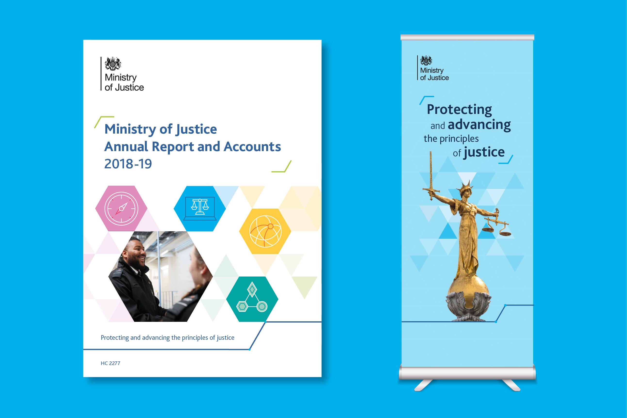
Refresh: Ministry of Justice (MoJ)
MoJ felt their branding had become repetitive and corporate, with communications overusing the same layouts and dark blue from the colour palette. They wanted a new look and feel that would be bright, dynamic and modern and that would communicate the organisation’s gravitas without appearing dark and sombre.
We presented two routes, a rebrand and a refresh. The refresh option was chosen as we were able to show MoJ how their existing branding could be used to its full potential by:
- adding both a bright and dark shade for each colour in the brand palette, allowing for more variation and accessibility in designs
- keeping the original brand font but allowing for more creative use of typography
- removing the outlines from the existing triangle graphic device, making it feel fresher and more dynamic
- introducing a new cut out imagery style for use when communicating sensitive topics and where photography options are limited
- providing a wider variety of layouts in the guidelines
This project is considered a refresh because the existing brand elements were evolved to allow for more variation in designs and to create a more modern look and feel.
Rebrand: Government Campus
A new curriculum for government skills was launched in January 2021 to provide training opportunities to civil servants. The Campus for Government Skills asked us to create a brand that was clear, versatile and easily recognisable. We presented three logos with accompanying identities, each focusing on important elements from the new brand strategy. The chosen route incorporated:
- a new name, ‘Government Campus’, that succinctly identified the project’s purpose
- a multicoloured strand element to visually represent the different training areas
- a logo featuring the multi-coloured strand design that visually conveyed the way Government Campus brings the different training areas together
- a vibrant and diverse colour palette that gave the brand identity personality and reflected the wide range of training offered
- a geometric font that complemented the curved corners of the logo
This project is considered a rebrand because everything about the branding changed, including the name.

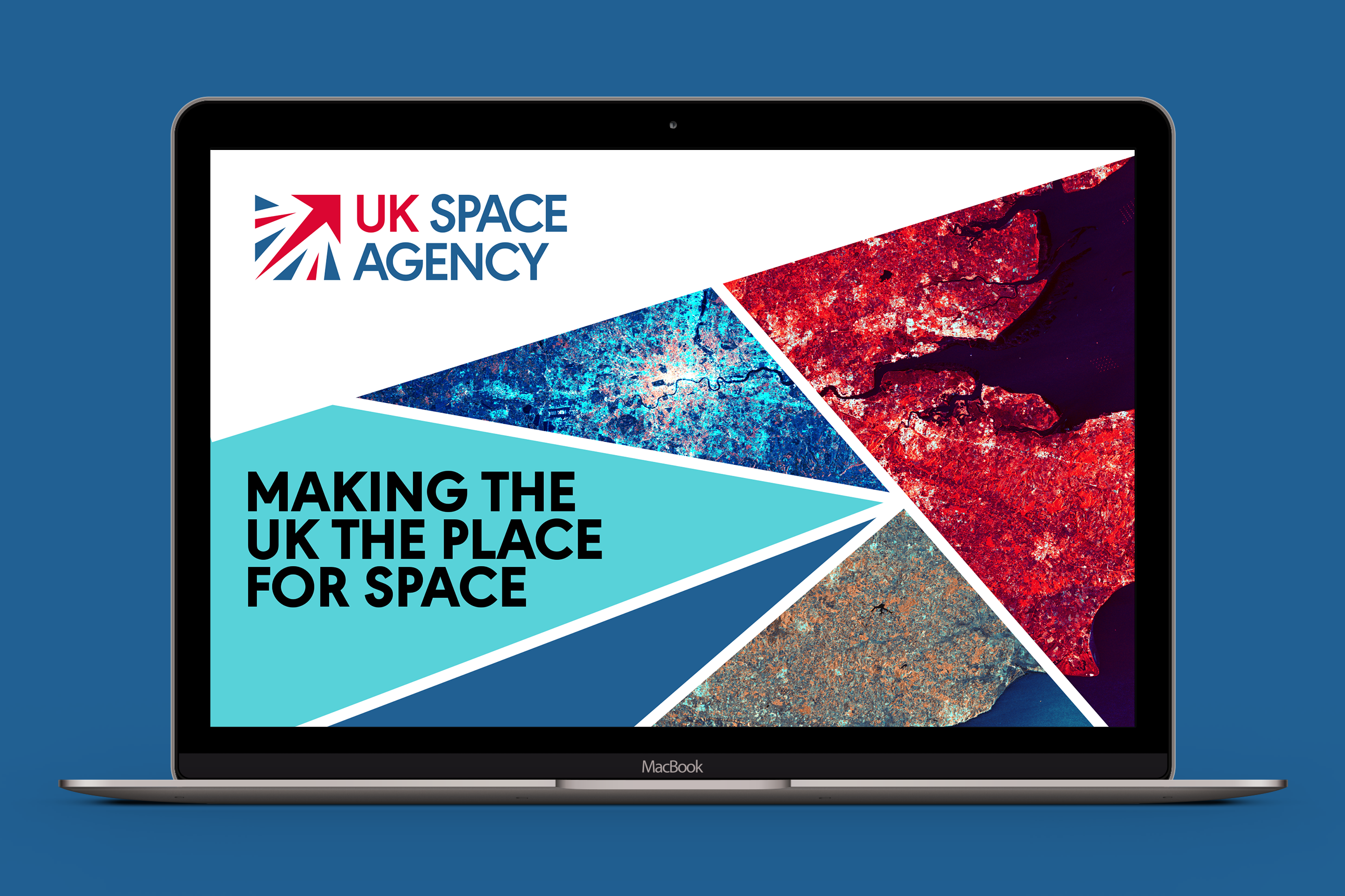
Refresh: UK Space Agency
The UK Space Agency felt their brand had become stale and wasn’t fully resonating with their audience. They wanted a new look and feel that reflected the dynamic and modern work they do and their status as global thought leaders within their field.
We presented three routes, two of which were rebrands and one which was a substantial refresh. They chose the refresh which involved:
- redrawing the logo to better reflect the union jack and brightening the colours to make it feel more positive and dynamic
- selecting a more accessible and versatile geometric font that invoked thoughts of physics and space
- developing a new icon style inspired by technical drawings which had a futuristic feel and complemented the new brand font
- introducing a broader colour palette including light and dark shades, making options for future assets more versatile and accessible
This project is considered a substantial refresh as we kept the essential elements of the existing logo due to it being well-recognised within the industry, while all other brand elements were changed.
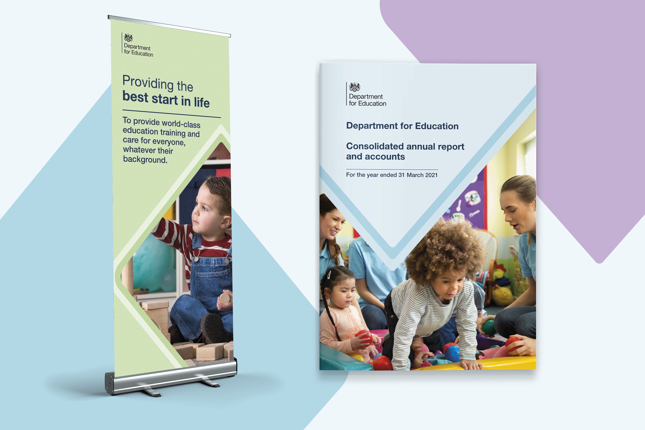
Rebrand: Department for Education (DfE)
DfE felt their brand guidelines were limited and had become outdated. They wanted us to create a brand that reflected their purpose and empowered staff when creating branded communications. The design solution included:
- a diamond-shape graphic device with journey lines inspired by DfE’s purpose of realising potential and bettering futures through education
- six brighter and five darker colours (added to the existing DfE dark blue) to align with accessibility standards and give more variety and life to designs
- a new photography style featuring well-lit natural images that showed a diverse mix of people reflective of DfE users
- new presentation templates which, alongside the new photography style guide, helped internal staff feel more confident producing communications
- an accessible font that complemented the logo
This project is considered a rebrand as although the dark blue colour and logo (which aligned with existing government identity system logos) were unchanged, all other brand elements were new.
Still unsure what’s right for you? We can help
At Design102 we have successfully rebranded and refreshed brands for numerous public sector organisations, so if you’re considering either please get in touch at hello@design102.co.uk
For regular Design102 updates ...