We rely on differences in colour to know if food is ripe or properly cooked, when to stop or go at traffic lights, which is the hot or cold tap, how to navigate the London tube (or any transport) map, to differentiate elements of bar or pie charts, to tell one sports team from another etc. Using colour to distinguish and differentiate is a common feature in almost every aspect of everyday life. It seems such an obvious, easy and simple difference, right?
Now look around you, how many people can you see? ‘Colour blindness’ - the common name for colour vision deficiency, affects up to 1 in 12 men and 1 in 200 women worldwide. That’s a staggering number of people affected by an inherited condition that is frequently ‘invisible’, overlooked and unconsidered. If there are 24 people near you right now, it’s possible at least two of those people see the world very differently.
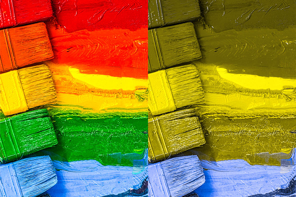
Despite the condition name and the common myths, colour blind people are not blind, nor do they only see in black and white. People with colour vision deficiency do see colour but the perception of certain colours and shades is not easily distinguishable and can be perceived significantly differently than intended. Red/green colour vision deficiency is the most common and can range from difficulty discerning particular shades to a recognition of only three or four colours. Because red and green are two of the three primary colours, if these are affected, almost all visible shades may be distorted.
Protanopia affects red light perception. Blues and purples are often confused when the ‘red’ element of purple isn’t recognised resulting in a blue shade.
Deuteranopia affects green light perception. The ‘green’ element isn’t recognised resulting in a yellow or brown shade.
Tritanopia is the least common form and affects the difference in perception of yellow and blue light.
At Design102, the use of colour is a central part of our world and we strive to design comprehensively, considerately and effectively. We are conscious of brand recognition, efficient data visualisation, and the inclusive requirements of a diverse audience so we achieve by acknowledging and embracing these factors. Helpfully, many of the design ‘top tips’ for accommodating colour blindness across all design formats are regarded as design best practice anyway:
- We usually recommend a minimal complimentary colour palette to encourage consistency and eliminate the possibility for confusion when too many colours are involved
- We try to ensure colours have sharp contrast and significantly different hues
- We incorporate patterns and textures in addition to colour to help distinguish between closely related data/elements
- We develop suites of icons and symbols so we don’t rely solely on colour to convey context
https://vimeo.com/216162765
So how aware are you? Some food for thought:
- Cadbury and Milka are both brands renowned for distinctive purple packaging but to many, that ‘recognisable’ branding is simply blue
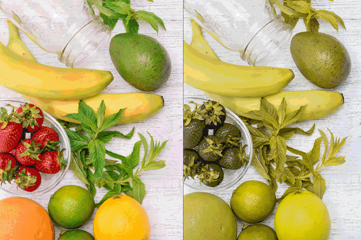
- Fresh limes may look similar, if not the same, as lemons. Similarly, unripe green bananas or tomatoes may look like ripe yellow bananas or ripe red tomatoes
- If attending a football match, the contrast between the football kits and match officials, the green grass of the pitch, a colour ball, the substitutions board in red/green LEDs, the seat selections during the ticket booking process, and the stadium wayfinding or security signage could all be affected by colour vision deficiency. Almost 3 million people in the UK have colour vision deficiency, that’s enough to fill Wembley stadium to capacity more than 30 times. In a sold out 60,000-seat stadium there is, on average, 5,000 colour vision deficient guests

- Health and safety issues can vary from the inability to recognise sun burn, colour-coded electrical wiring and safety equipment, to knowing when meat is fully cooked
- ‘Green for yes/go’ and ‘red for no/cancel/stop’ is a common formula used in multiple formats for buttons or lights particularly on ticket and cash machines and on bathroom locks to show if facilities are vacant or engaged
- Shopping for make-up, matching clothes, food or household items may require additional consideration and assistance
- Rotas and calendars tend to divide and allocate by colour
Through basic consideration and colour blind awareness, small tweaks to everyday practices and items can and will improve perception and recognition for many people.
Top tips for colour blind awareness in design:
- Be aware and simply consider the intended use and audience for your design
- Be conscious that your family, friends or colleagues may not know they have, or want to share their knowledge of, a colour vision deficiency
- Include icons, captions or descriptive words in addition to colour to differentiate e.g. green buttons may also feature the word ‘enter’ or a tick symbol while red buttons could feature the word ‘cancel’ or an x symbol
- Use a minimal complimentary colour palette and consider using patterns, symbols or textures, or high contrast solid colours, rather than different shades or gradients
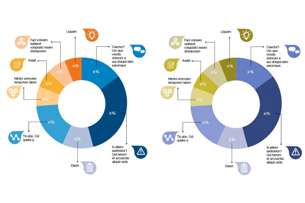
- If creating data charts, include written percentages with the segments of pie charts, alternate the texture/pattern of the data in bar charts by using stripes or cross hatching for every other bar, write the key alongside each line in line graphs
- Plenty of free sites online can show you how an image, data or other assets may look with colour vision deficiency (http://www.color-blindness.com/coblis-color-blindness-simulator/)
- Photoshop provides an inbuilt view option to display files as they would appear with colour vision deficiency (View > Proof Setup > Color Blindness – Protanopia-type or Deuteranopia-type)
- Many online sites provide information and advice on how to effectively produce accessible documents, assets or artefacts for a more inclusive audience
For more information on colour blind awareness, please visit http://www.colourblindawareness.org/
To do an online colour blindness test yourself, please visit https://www.color-blindness.com/ishihara-38-plates-cvd-test/
#ColourBlindAwarenessDay, #Iam1in12, #Iam1in200, #kickthestigma
If you’d like to know more about Design102 or you’ve got a project we can help with, just drop us a line at hello@design102.co.uk
For regular Design102 updates ...