At the heart of any successful brand is the right logo. It has the power to communicate your brand’s message, personality and values, helping your audience recognise who you are and what you stand for. Your logo is often the first interaction people have with your organisation, so it needs to make a strong impression and build trust.
At Design102, we know how important it is to get logo design right. So we’ve put together our top 6 principles for creating a logo with purpose and impact.
1. Simplicity
Keep the design clean and simple, and don’t overcrowd it with detail. A simple logo is easily recognised, instantly memorable and more effective in conveying your brand’s message at a glance.
2. Originality
Create a logo that is unique and memorable. It should distinguish your brand from competitors and avoid any potential confusion or similarity with existing logos. An original design will stand out and speak clearly to your audience, leaving a lasting impression.
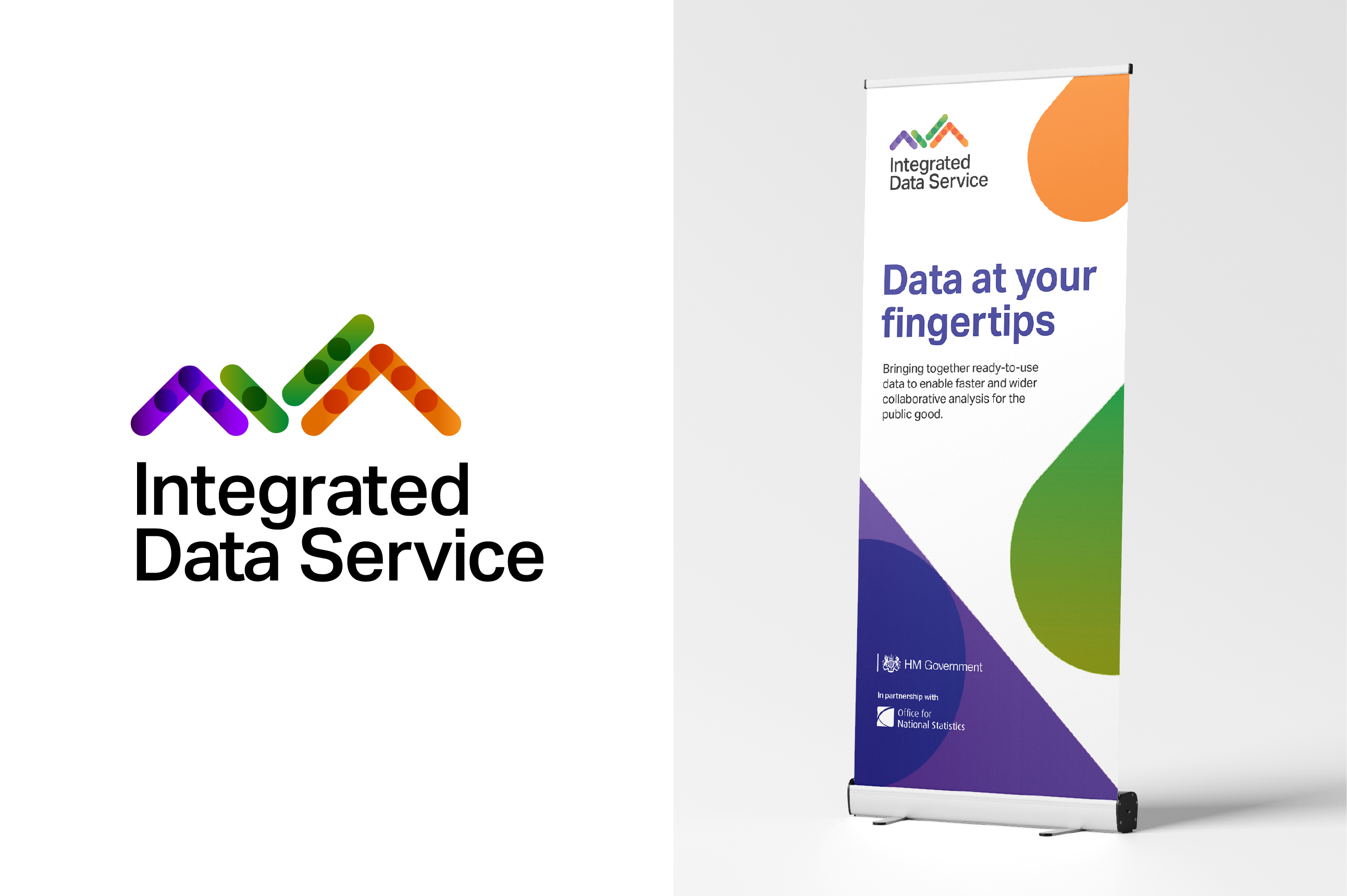
As a new service, the Office for National Statistics’ Integrated Data Service needed a logo that set it apart and made its purpose clear: to bring together high-quality data and improve how data is shared. Our unique design is made up of graph-inspired shapes, with small circles to represent plotted points. In the centre is a subtle tick, reflecting the authority and security of the service.

3. Timelessness
Strive for a logo design that can stand the test of time and remain relevant for years to come. Simplicity is often the key to longevity, so it’s best to avoid using trendy elements or styles that may quickly become outdated.
4. Relevance
Align the logo with your brand identity and the purpose of your organisation. It’s crucial to consider your target audience and industry so the design truly resonates and helps them understand how the logo matches your brand name or story. Think about the psychological impact of colours on your audience and select fonts that are legible and appropriate for them.
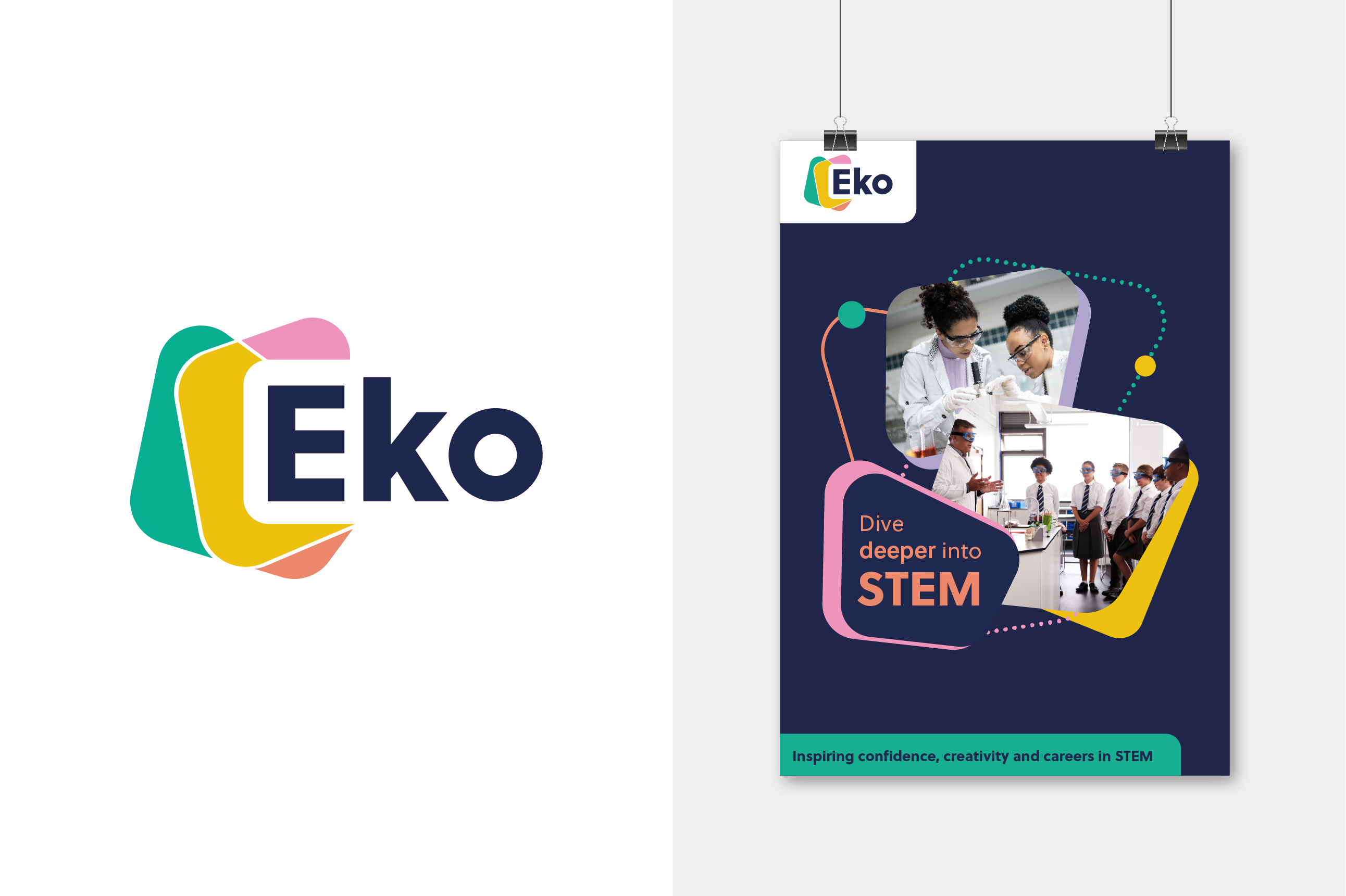
The Ministry of Defence needed our help branding their in-school programme, Eko, to engage children with STEM subjects. The name is adapted from the word ‘echo’, linking to depth, navigation and moving forwards. In a good example of tailoring design to the target audience, our logo uses shape to create excitement around STEM learning, without being too childish for secondary children or too intimidating for primary children. The layering effect conveys the different possibilities that STEM offers, while also nodding to the periodic table.

5. Functionality
Make sure the design is clear and recognisable in different sizes, formats and applications. For this, it’s crucial to know where your logo will appear and how it will be used – whether that’s on large building signage, billboards and event banners, or small business cards, lanyards and email signatures. Functionality is the basis for all design elements and your logo should be scalable up and down, without losing legibility or visual impact. Details, patterns or straplines often look fine at normal size, but become lost on smaller assets and online favicons.
6. Versatility
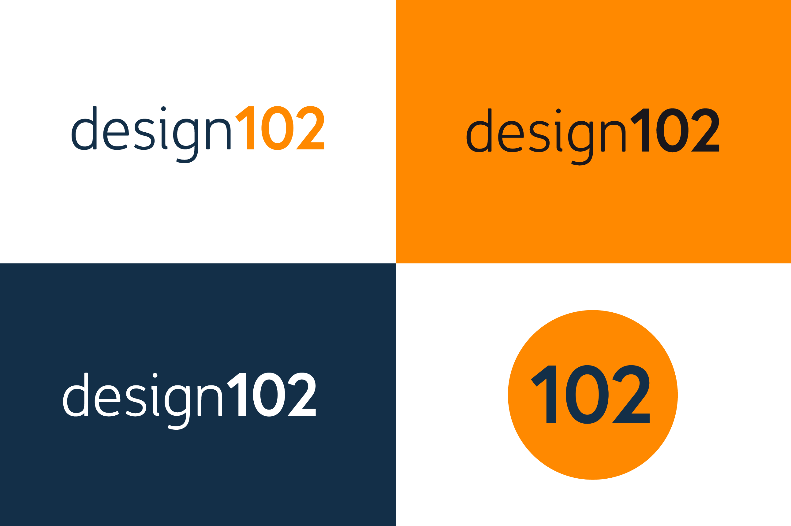
Remember, the best logos are versatile and work just as well in black or white. Your logo may appear on solid colour backgrounds if third parties use it alongside other logos or branding that isn’t yours. Logos that have a clearly defined shape or use colours only for aesthetic reasons translate better. But if colours have very specific significance, the meaning may disappear in plain black or white.
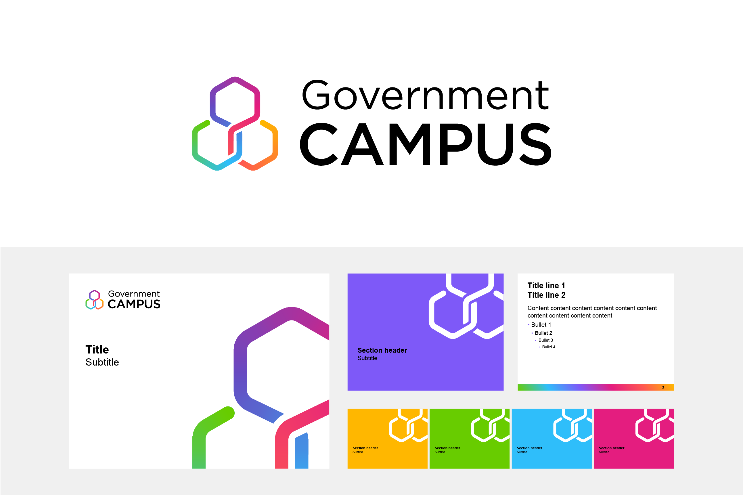
When branding Government Campus, which brings together training for the whole of the Civil Service, we created a logo using open, interconnecting strands in a visual representation of bringing resources together. In full colour, the diverse palette reflects the range of learning and development on offer and the transformation that Government Campus is hoping to achieve. In plain black or white, the logo still works well and remains recognisable due to the strong interlocking shapes which clearly align to the brand’s purpose.

These principles are only guidelines, and there are exceptions based on specific design requirements or creative concepts. For a logo with lasting impact, it's essential to tailor the design to the unique needs and characteristics of your brand, while considering its target audience, industry and accessibility.
If you’re in need of a new logo for your brand and want to know how Design102 can help, drop us a line at hello@design102.co.uk
For regular Design102 updates ...