Design
From text-based models to generative platforms, AI is infiltrating all areas of work. Here, we explore different models and uses, and talk about how we use them at Design102, including the new GCS Assist tool.
A good agency briefing will set your project up for success from the start, but it can be confusing knowing what to include. Learn Design102’s top tips for writing a creative brief, from the ‘must-haves’ to ‘nice-to-knows’.
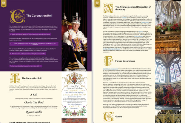
In a historic first, the Coronation Roll of Their Majesties King Charles III and Queen Camilla has been made publicly available as an interactive website. Read on to discover how Design102 did it.
At the heart of any successful brand is the right logo. Your logo is often your audience’s first interaction with your organisation, so it needs to have impact. Learn 6 top principles used by Design102 to create your perfect logo.
In modern Britain, we’d expect to see people with a wide range of characteristics in our advertisements, media and government communication. But this isn’t always the case. Learn how to choose and use diverse, inclusive photography and illustration.
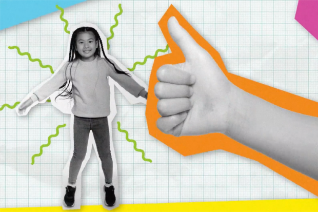
As communications experts, Design102 know that child audiences can be challenging to engage. Our award-winning illustrator shares her 5 top tips to help you create designs that are sure to have impact.
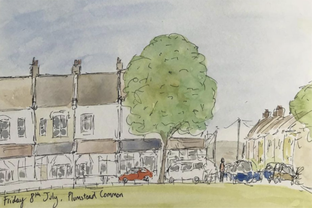
With the pandemic changing the way we work, we asked everyone at Design102 about creativity – what motivates us, how we stay creative and where we look for inspiration. Learn our tips and tricks for keeping that creative spark alive.
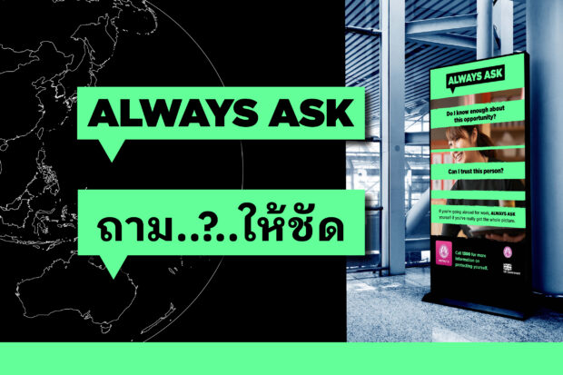
Creating a campaign for an international audience comes with a unique set of challenges. Design102 detail the key issues you should consider when speaking to people overseas.
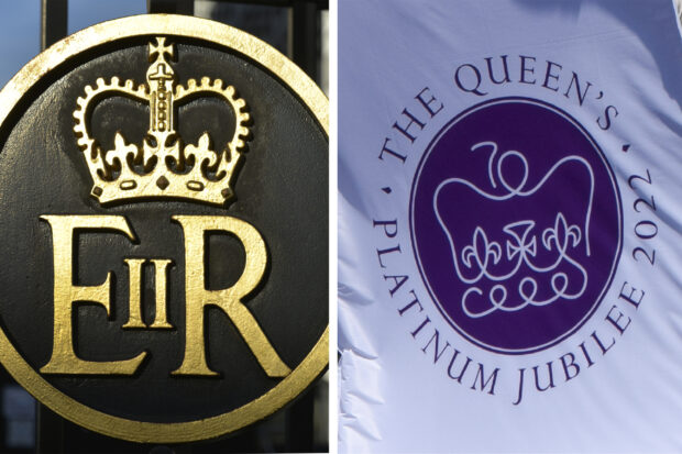
Many examples of contemporary design reference great graphic design from the past. To mark the Platinum Jubilee year, this article is looking back over the last 70 years to see how classic design influences our work at Design102.
If your project involves large amounts of data, how you present that information is crucial for ensuring it’s clearly understood. Design102 explain why data visualisation is the design solution you need to make your data more vibrant, engaging and accessible.
