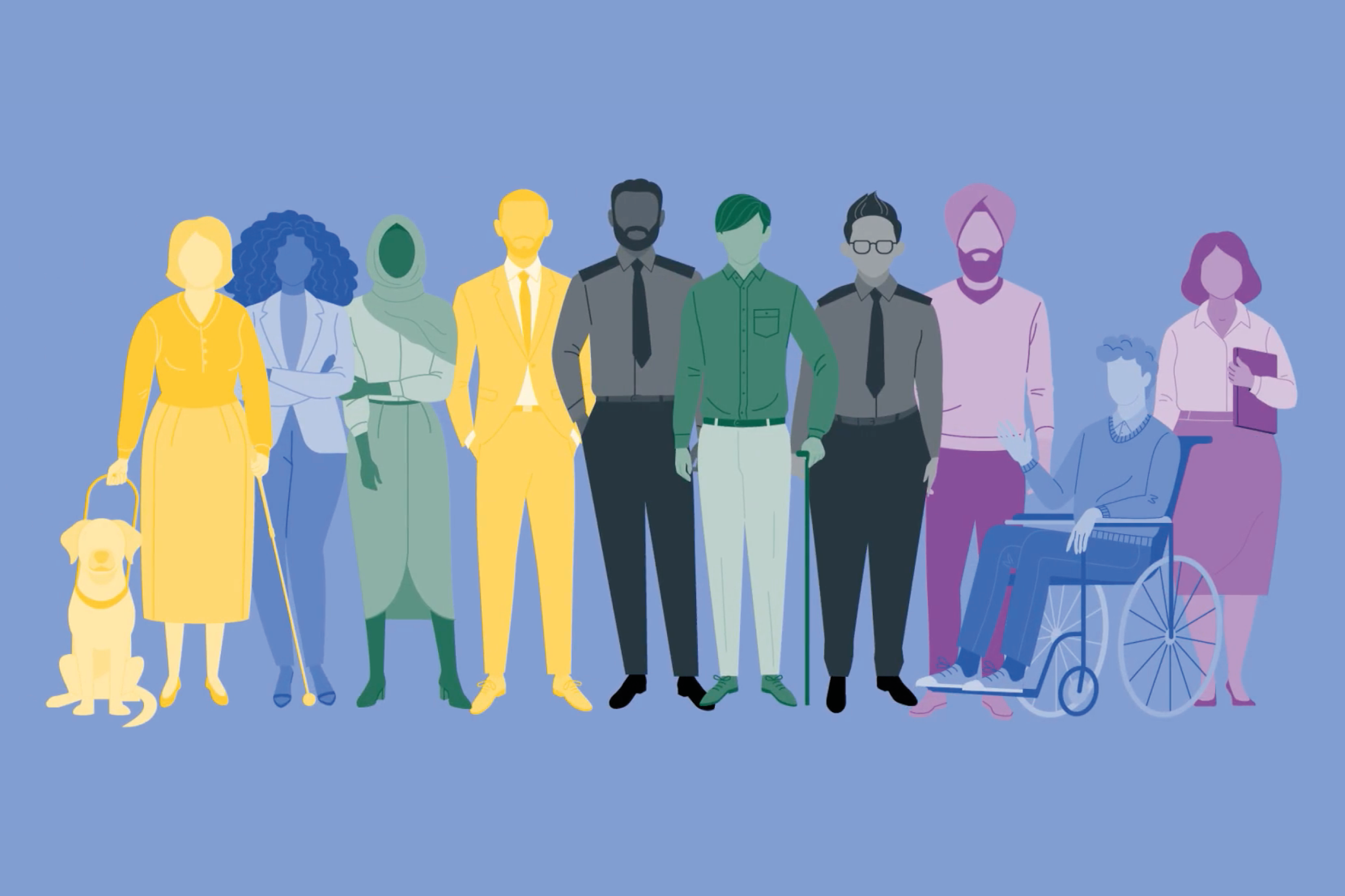
In a diverse and modern Britain, we would expect to see all sorts of different people with a wide range of characteristics in our advertisements, media and government communication. But this isn’t always the case, and some members of the public often feel left out of public discourse.
In 2022, we attended a webinar hosted by Getty Images called Visualising Diversity and Inclusion. This got us thinking about identity in more detail. We expect brands to be supportive of diversity and inclusion, and that expectation falls on the government too. So, how do we make sure that we are visualising the country we live in in an authentic way?
What’s the problem?
Symbolic annihilation is a term that you may not be familiar with, but in the past brands and even government have been guilty of it. This term is used to describe the absence of underrepresented groups across media and public messaging. Historically, for many years, characters on our screens and across our advertisements have fallen into one category, usually white and usually male. It’s vital to recognise that if people don’t see themselves represented in media, they can feel like they’re not important.
Some protected characteristics we know a lot about include race, gender and sexuality. But there are others who get overlooked. Age, faith, disabled status and whether you’re married or pregnant all fall under the protected characteristics banner.
If we think about people of a certain age, rarely would we see a person over the age of 50 portrayed in an office setting. Stock images are more likely to show a workforce aged around 25 to 30, but is that the reality? Pregnant women tend to only be visualised in scenarios that don’t go past the fact that they are pregnant. There’s lots of characteristics to think about that go beyond what we’re used to.
Solving the problem with illustration
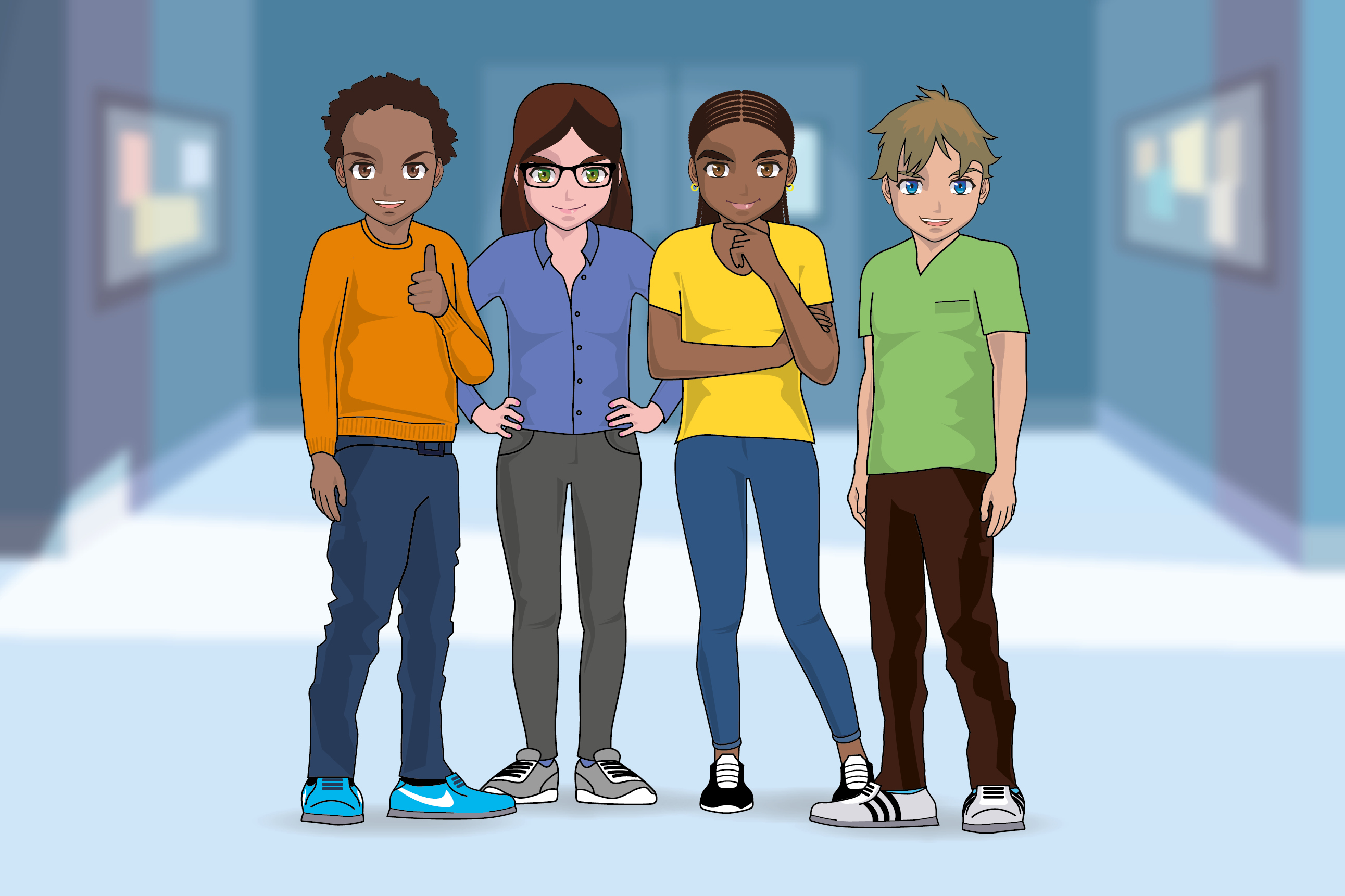
Using illustration is one way we can address the issue. Creating characters with illustration is an essential part of storytelling, and ideas can be easily communicated through their appearance and actions. With illustration, we have the ability to choose a character’s age, gender, skin tone, expression and even personality – the possibilities are endless.
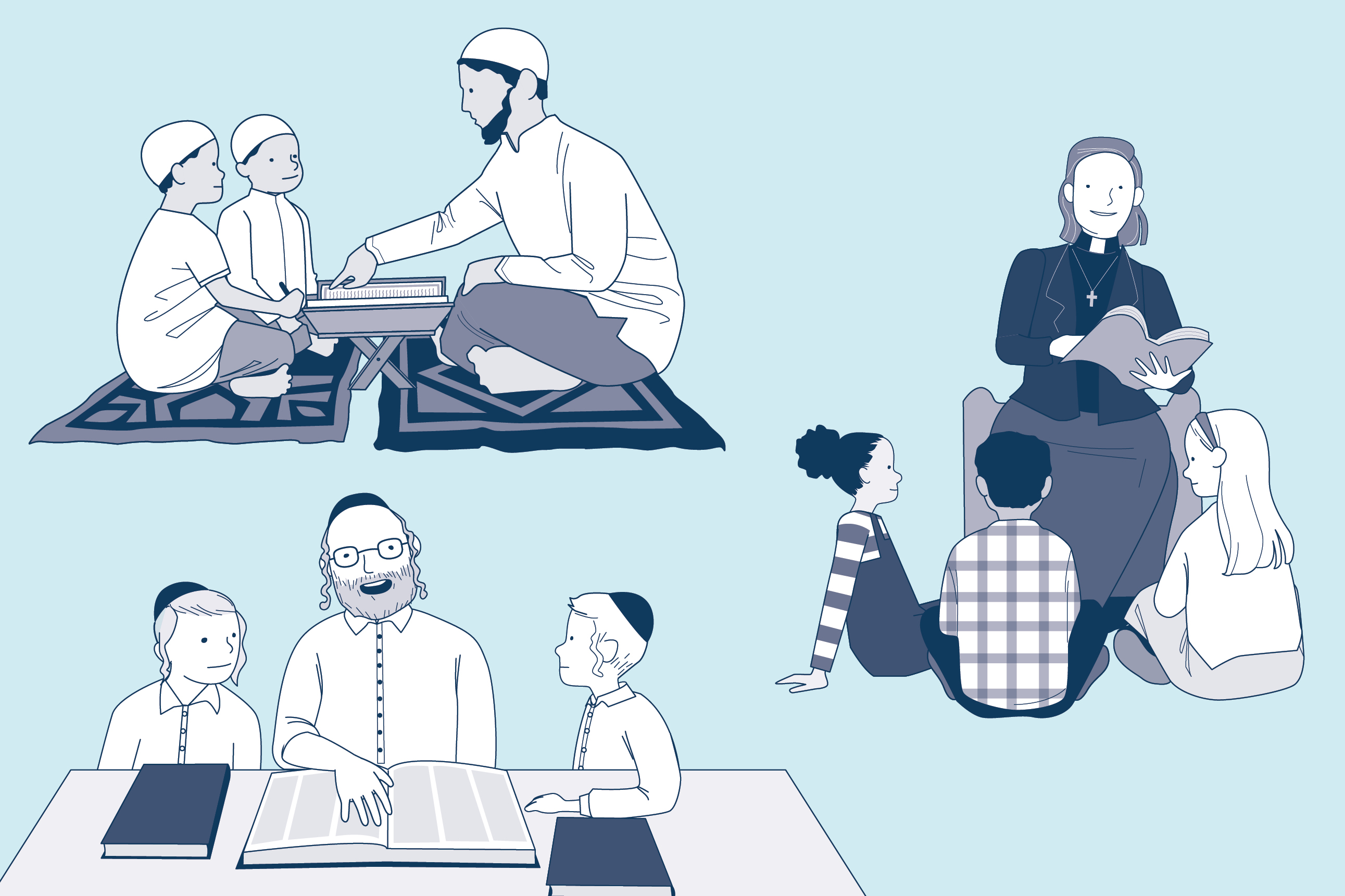
If we want to create a project that shows diverse skin tones, we would carry out research to understand the wide range of ethnicities. Doing a quick image search and using a photograph for reference is a good way of creating a collection of diverse faces. And we would always steer clear of perpetuating negative stereotypes as this can do as much harm as non-representation.
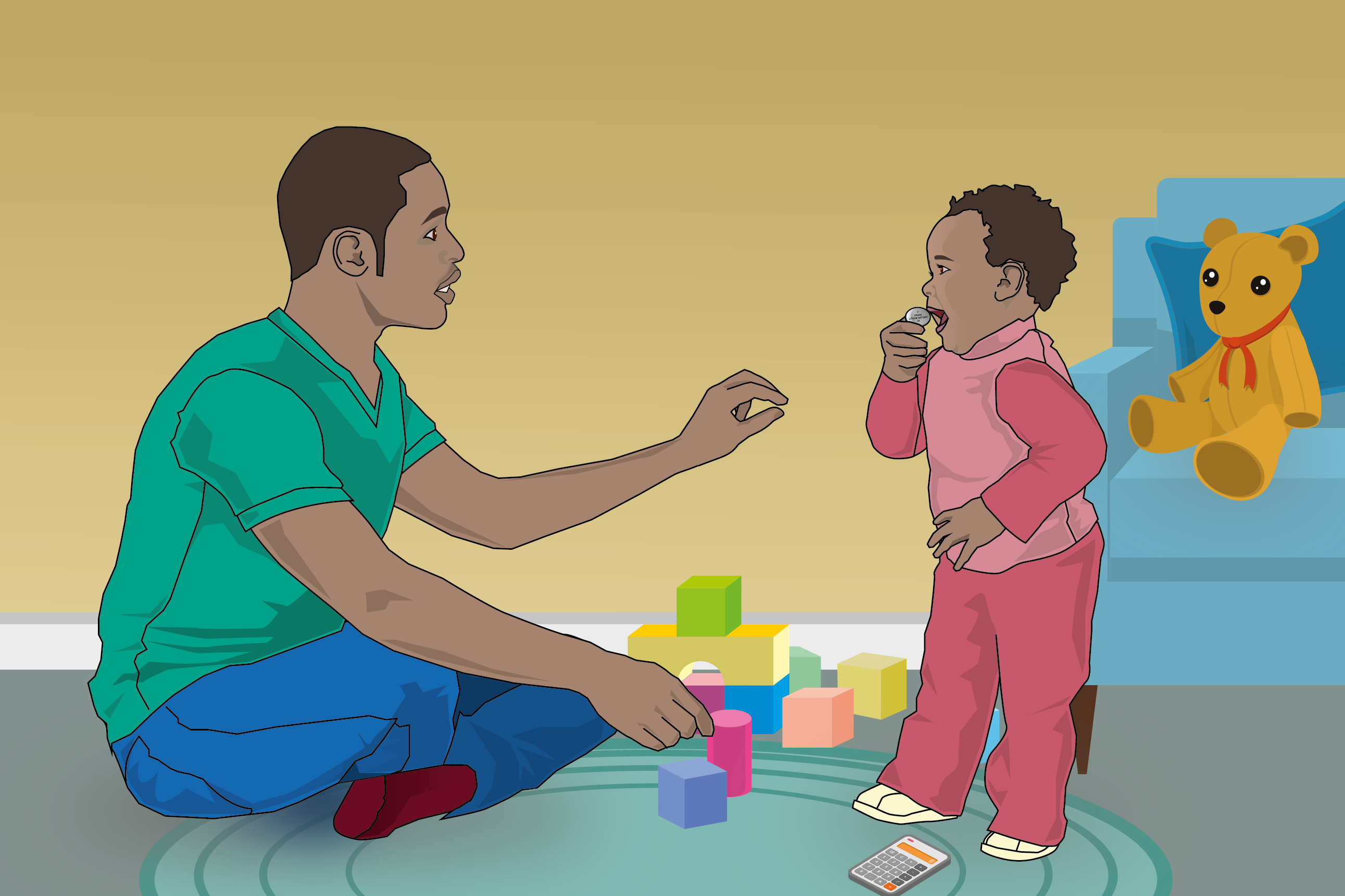
Illustration is also a great tool for exploring big ideas and representing all walks of life, even when photography isn’t an option. You might also find it difficult to get photographs from certain settings. A project that focuses on prisons or border security for example, will be harder to organise photography for.
Illustration also gives us opportunities to challenge the norm. We often traditionally thought of certain jobs only employing a certain type of person. Primary school teachers and nurses being women, scientists and engineers usually being white men. But with illustration’s limitless potential, we can change these pre-assumed biases while also showing underrepresented groups that they would be welcomed in any profession.
Solving the problem with photography
With photography, it might feel a little trickier to achieve visual diversity. There are many constraints that get in the way; time, budget, location of people in the country, are they working from home? Does your diverse workforce even want to be photographed? So, it’s important to be aware of the difficulties of photography.
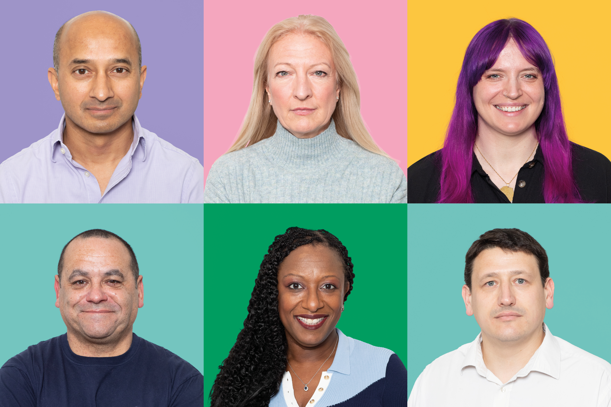
If we do think about photographing your own staff, you should make sure to accurately represent the make-up of your organisation or team. Job-hunters may be looking for reassurance that your organisation has a fair gender balance, or that people with access needs are able to work in and move around your office with ease. Showing a diverse range of people helps audiences to understand that you have a welcoming and inclusive environment.
However, you should not use photography to overstate how diverse your team is. Don’t mislead audiences or rely on certain colleagues to be your poster people. And always remember that people may not wish to be photographed at all!
What’s it all for?
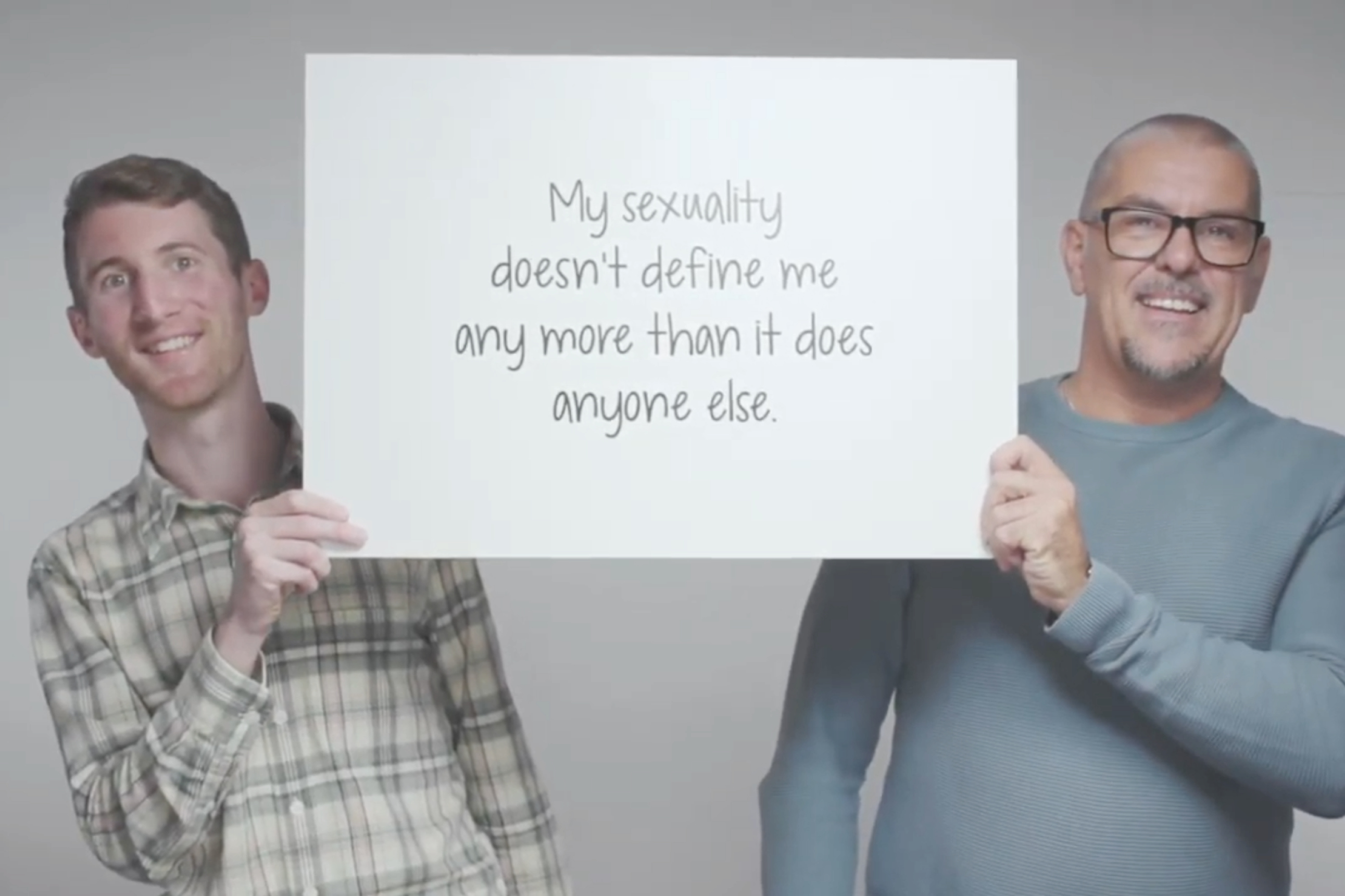
The more we showcase people from different backgrounds and with different lived experiences in our projects, the more engaged our audiences will be. The more people engage in the content we create, the more inclusive our culture will become. With a more inclusive culture comes trust and confidence in public messaging, which is ultimately what we’re striving for.
Design102 always has diversity and inclusion on our minds when creating a project. If you’d like to know more about Design102 or you’ve got a project we can help with, drop us a line at hello@design102.co.uk
For regular Design102 updates ...