It’s no secret that the key to great communication is proper audience understanding, yet this can often be overlooked or oversimplified when it comes to designing for children. As government communicators, children are an important segment of our audience and one we communicate with often. It's therefore especially important that we are reaching them effectively.
Design102’s Dunni Mustapha (whose children’s illustration won her a British Book Award!) has shared her 5 top tips to help you engage child audiences through thoughtful, creative design.
1. Create a character
It can be difficult to get children to engage with certain subjects, but a friendly and approachable character or mascot is a great way to help them feel connected. However, it’s important to do more than create a character that’s nice-looking — children need something they can relate to and want to learn from.
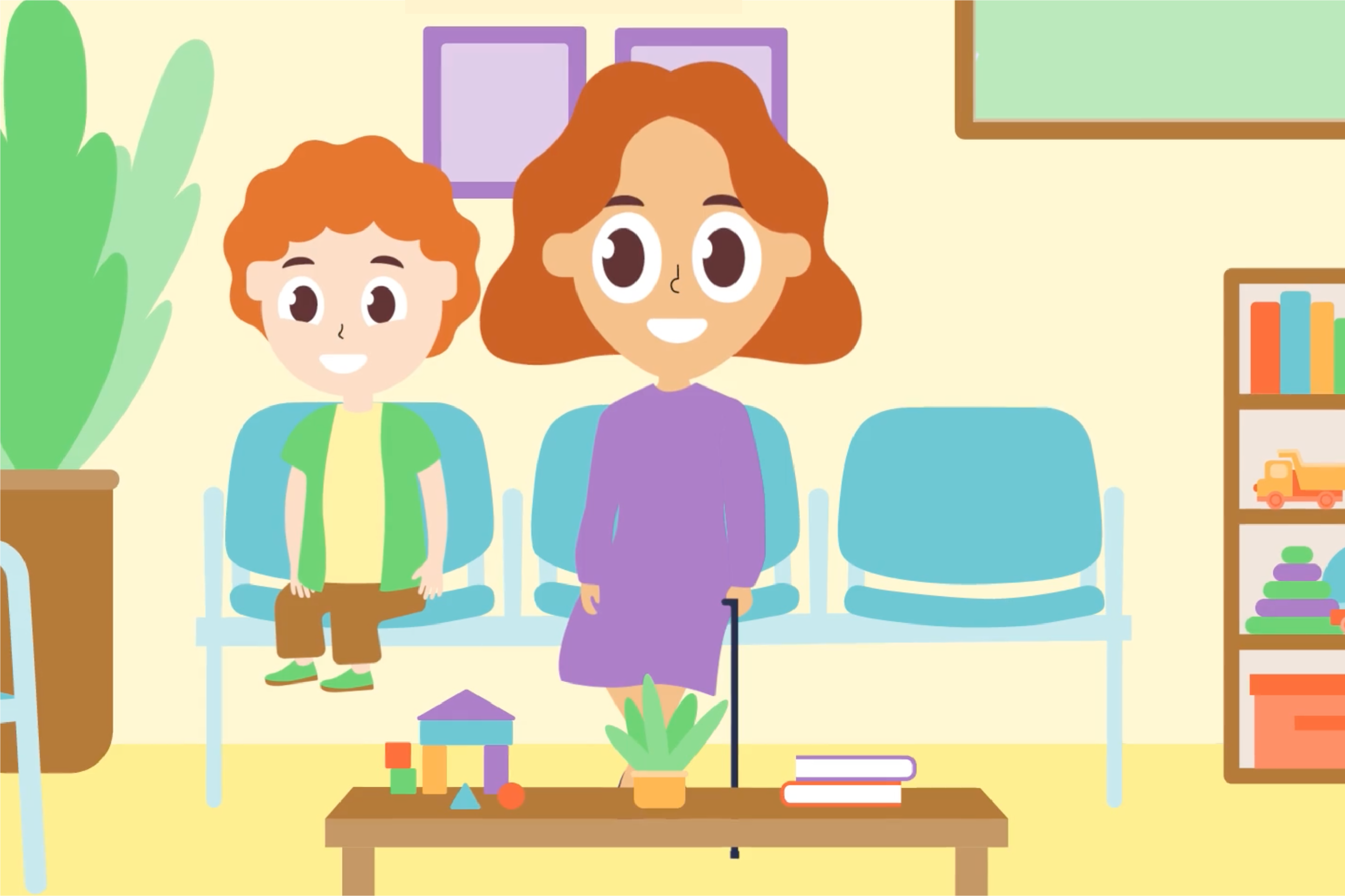
HM Courts and Tribunals Service approached us at Design102 to create 2 videos explaining the justice process to children, one for children under 10 years old and one for those 11 and over. We wanted to create characters that children could relate to, to help them feel like they were learning alongside someone similar to them.
We created 2 animated videos featuring main characters the same age as the target audiences. To tailor the content, we pared back the design for the 11s and over and increased the size of the heads, eyes and smiles for the 10 and unders. We also altered the script for both videos, using shorter sentences and simpler language for the younger audience.


Great characters don’t necessarily have to be human though, and animals work particularly well for child audiences.
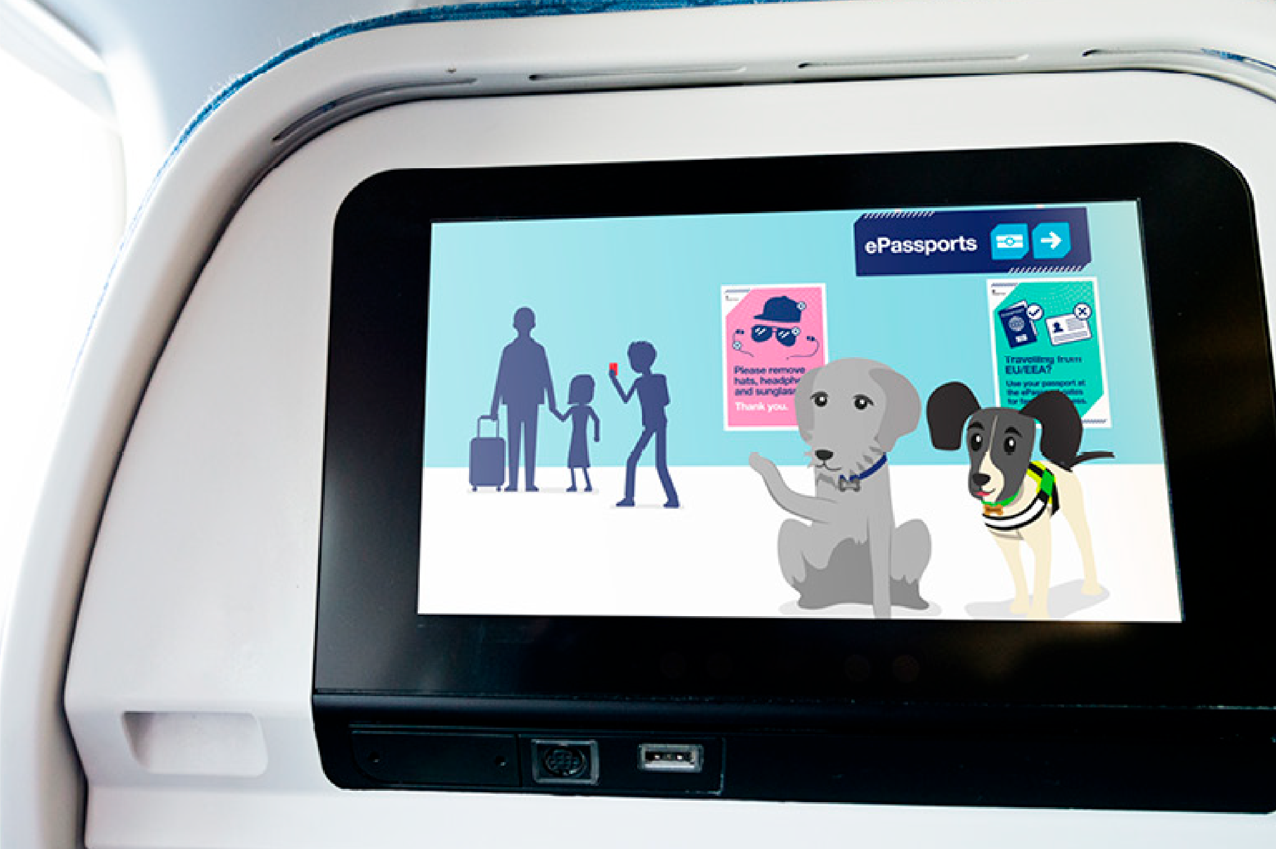
When Border Force came to us to help families with young children understand what happens at border control, our team created Border Paws. The 3 illustrated dog characters (based on real-life detector dogs) were given distinct personalities and fronted a range of items including puzzles, a comic and an animation. These fun canine characters helped make the border control information interesting, engaging and memorable for the child audiences.

2. Use colour thoughtfully
Bright colours can be stimulating and engaging, and because of this they’ve always worked well in design for children. It’s important to remember to avoid stereotypes when using colour. Children’s branding used to be very gendered, with pink being reserved for girls and blue for boys, but this has naturally become an outdated approach.
Instead, try thinking about how colours can convey different moods. When used purposely in this way, colours can do more than simply support messaging. Instead, they become part of the storytelling, helping children identify the tone of a topic and even register the intended emotional response.
3. Tell a story
So you’ve created an engaging character for your design. You’ve thought about personality, colour, and, if it’s an animation, the way it moves and speaks. But what use is all that if your design doesn’t tell a story?
It can be especially important to form a compelling narrative when designing for children, as it will help to hold their interest when learning about more serious topics.
We encountered this challenge when HM Revenue and Customs asked us to create a series of educational videos for their Tax Facts project. The videos aimed to explain tax to children and young people aged 7 to 25. For the ‘Why do we have tax?’ video, aimed at the 7 to 11 age group, we used narrative storytelling to explain the history of how modern society came to be built through communal tax systems.
By creating a story in this way, we were able to put the complex topic of tax into contexts the audience would know and understand. It also allowed us to include playful references which made the story more exciting and engaging, like involving cavemen and woolly mammoths.
4. … But keep to the point
While more abstract designs may work for adult audiences, when designing for children, we’ve found it’s best to keep things simple as too much playfulness can risk obscuring the message.
In the early stages of the Tax Facts videos, we conducted testing with a focus group of children from the target audience. It was revealed that participants preferred designs that were clearly related to the subject of tax, with less decorative or aesthetic elements. As a result of this testing, we pared back the design to ensure everything shown on the screen had a purpose.
We always advise testing your designs whenever possible. After all, your target audience is going to be best placed to tell you whether or not your design is hitting the mark!
5. Know when to be serious and when to be playful
In government communications we are often tasked with conveying important information, and so it’s necessary to be clear and concise.
It’s important to treat the subject of your design with an appropriate level of seriousness. However, a well-placed quirky character or dash of humour can help keep younger audiences interested and make learning feel more enjoyable and less like a chore.
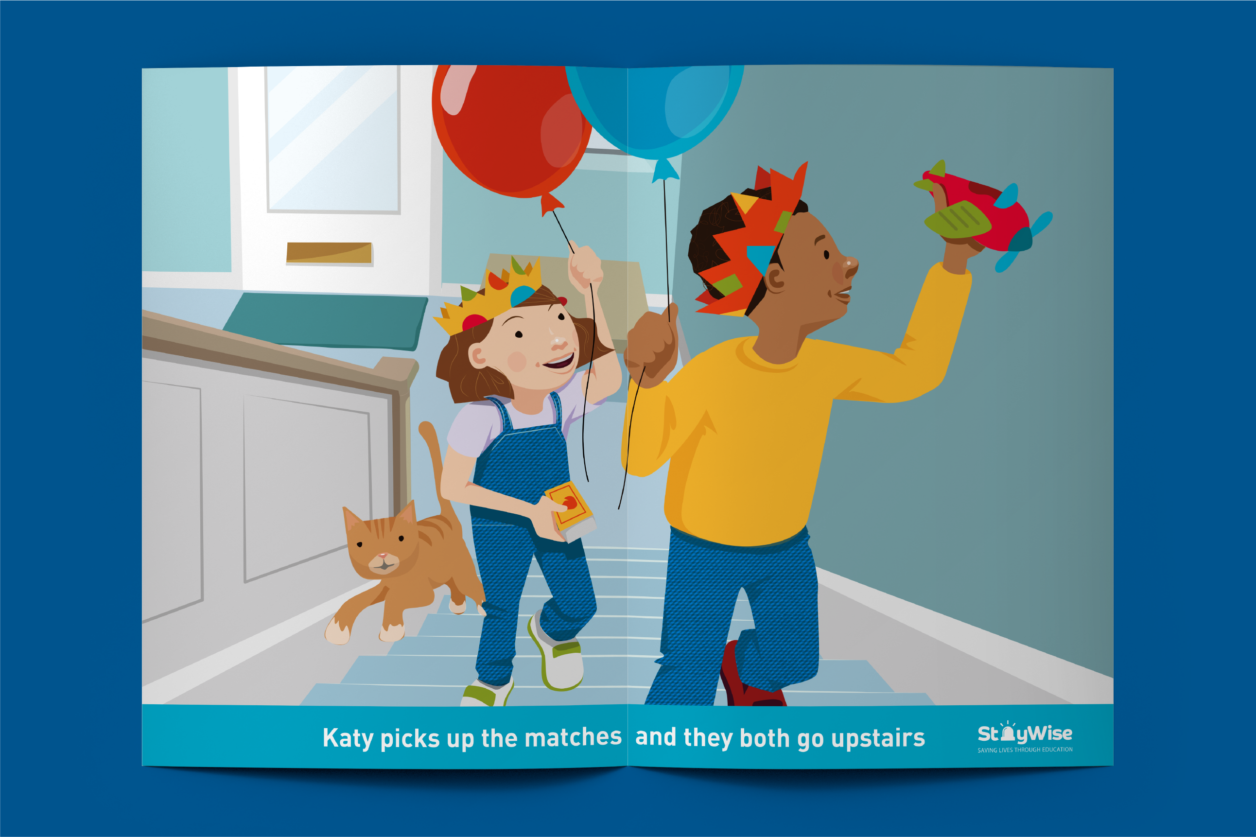
We took this approach when the Home Office asked us to create a range of children’s fire safety resources for their StayWise Fire Kills campaign. We wanted to make sure this important subject was delivered with the gravitas it required, but we didn’t want to come across too severe or frightening.
As a result, we created fun and interactive ways for children to learn about fire safety. This included colouring books, playing cards, interactive role-play scripts, and educational narrative stories. We avoided imagery and language that could be considered frightening and instead used the characters’ facial expressions and body language to convey emotions like worry, fear and relief.

To see more examples of our work, please view the Design102 website. If you’d like to know more about Design102 or you’ve got a project we can help with, drop us a line at hello@design102.co.uk
For regular Design102 updates ...